Life is a Creative Process: Provenance and Value in Art

“…Is there ever such a thing as a whole story, or an artist’s triumph, a right way to look through the glass? It all depends on where the light falls.”

Jessie Burton, The Muse

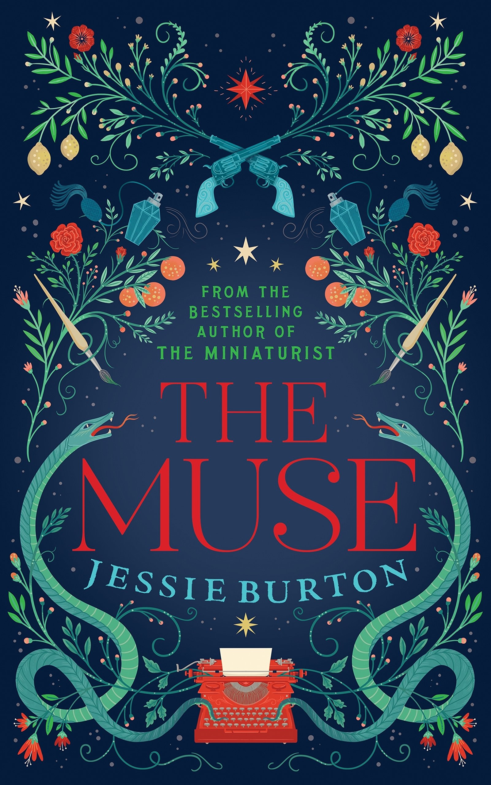
I love it when I come across a book I’d forgotten about. I purchased The Muse by Jessie Burton a few years ago, and as is my tendency, addiction even, to hoard books and novels, I added it to my ‘to read and ongoing’ piles around the house. Somehow it got buried.

As I’ve been decluttering and reorganising I came across it, just at the moment I decided I needed a break from research and non-fiction.

Jessie Burton is now my muse! It’s a fantastic novel, it stimulated my creativity and motivation in many ways, which is auspicious with #NaNoWriMo (national novel writing month) coming up in November, where writers aim to get 50,000 words onto paper or screen.

I ended up studying it anyway, a masterclass in historical, literary fiction, I couldn’t put it down.

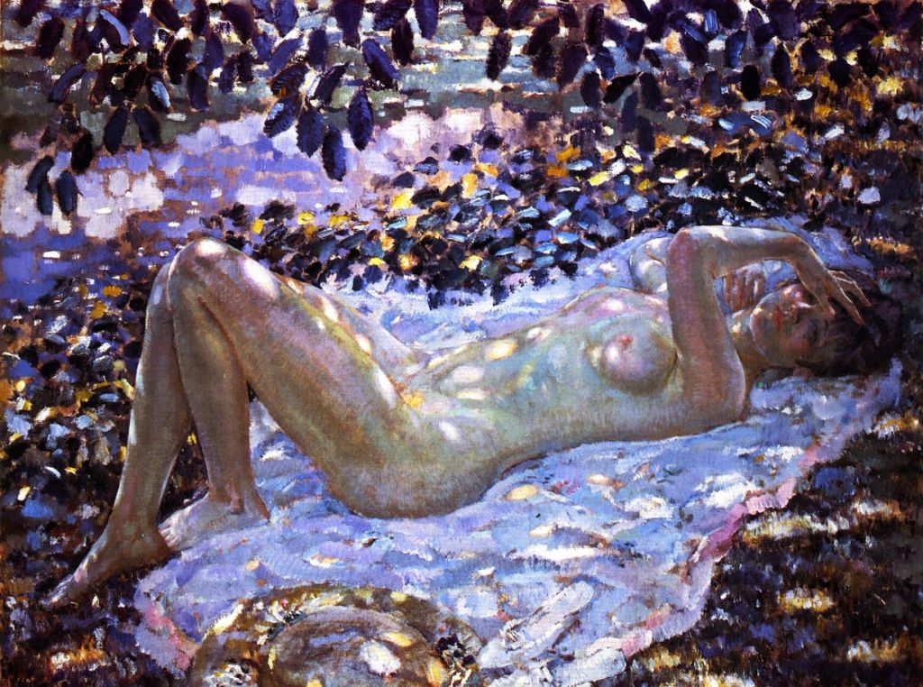
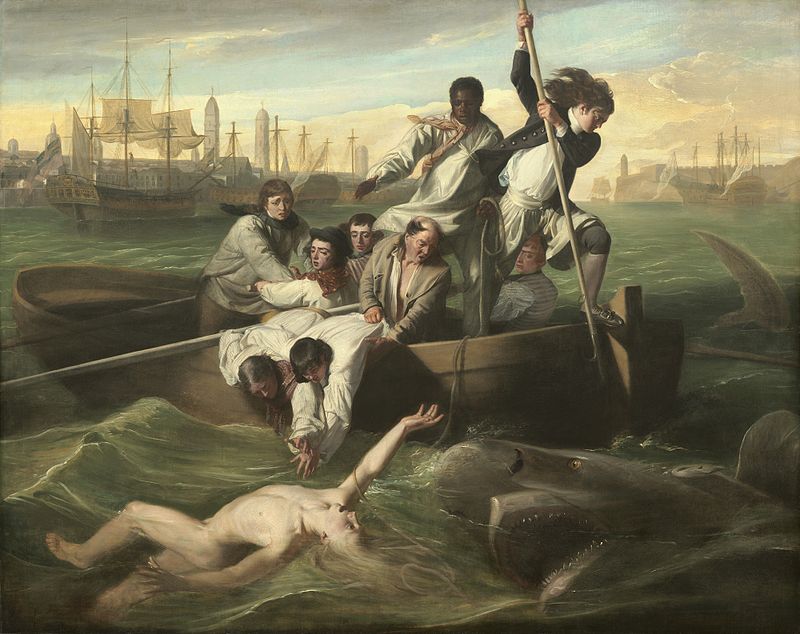
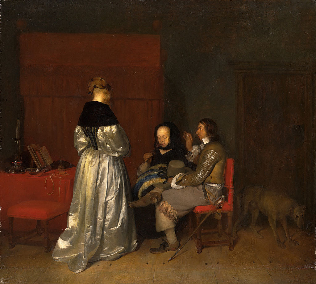
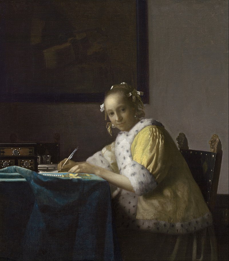
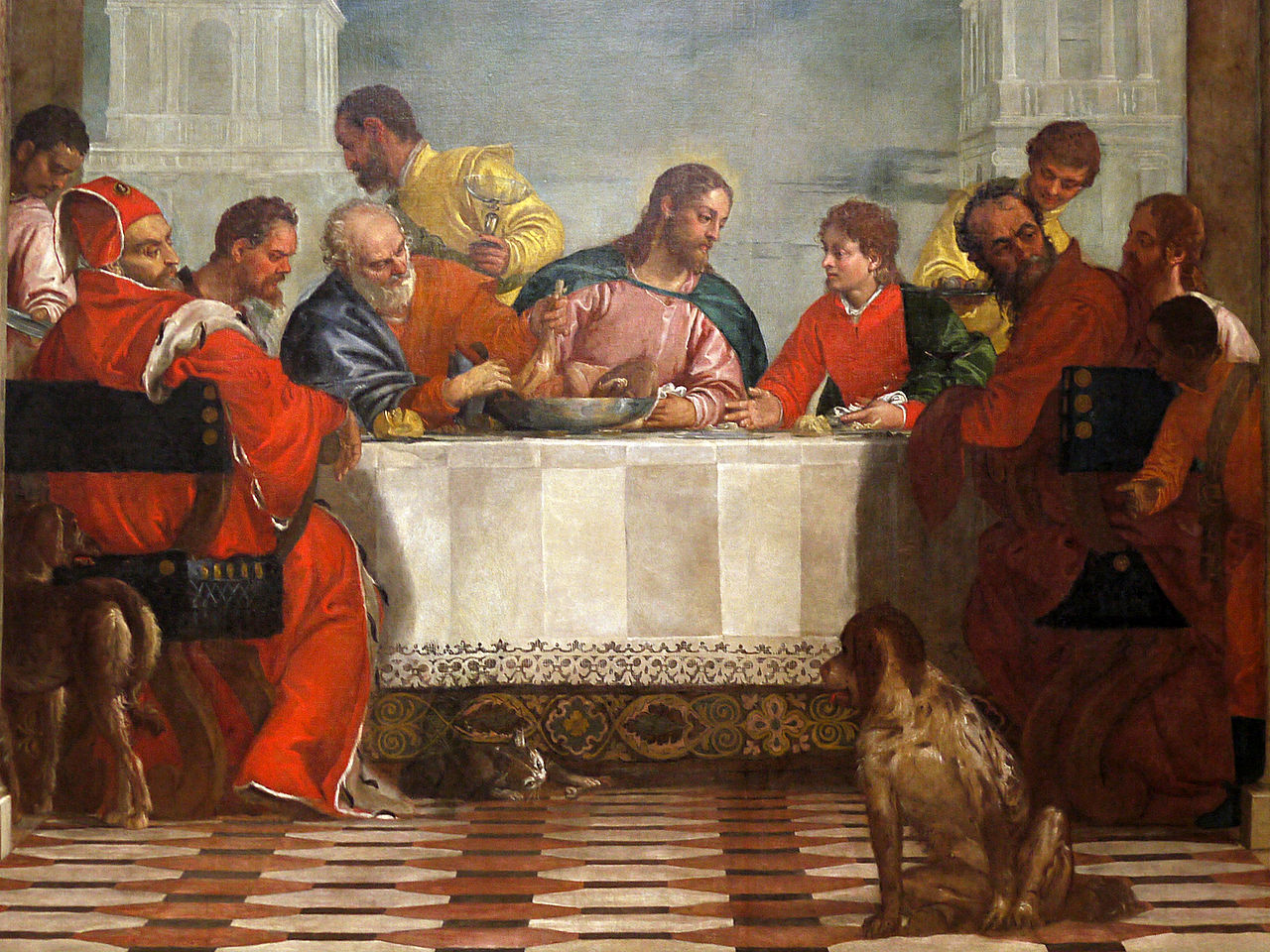
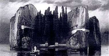
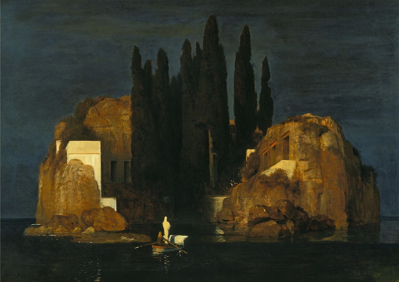
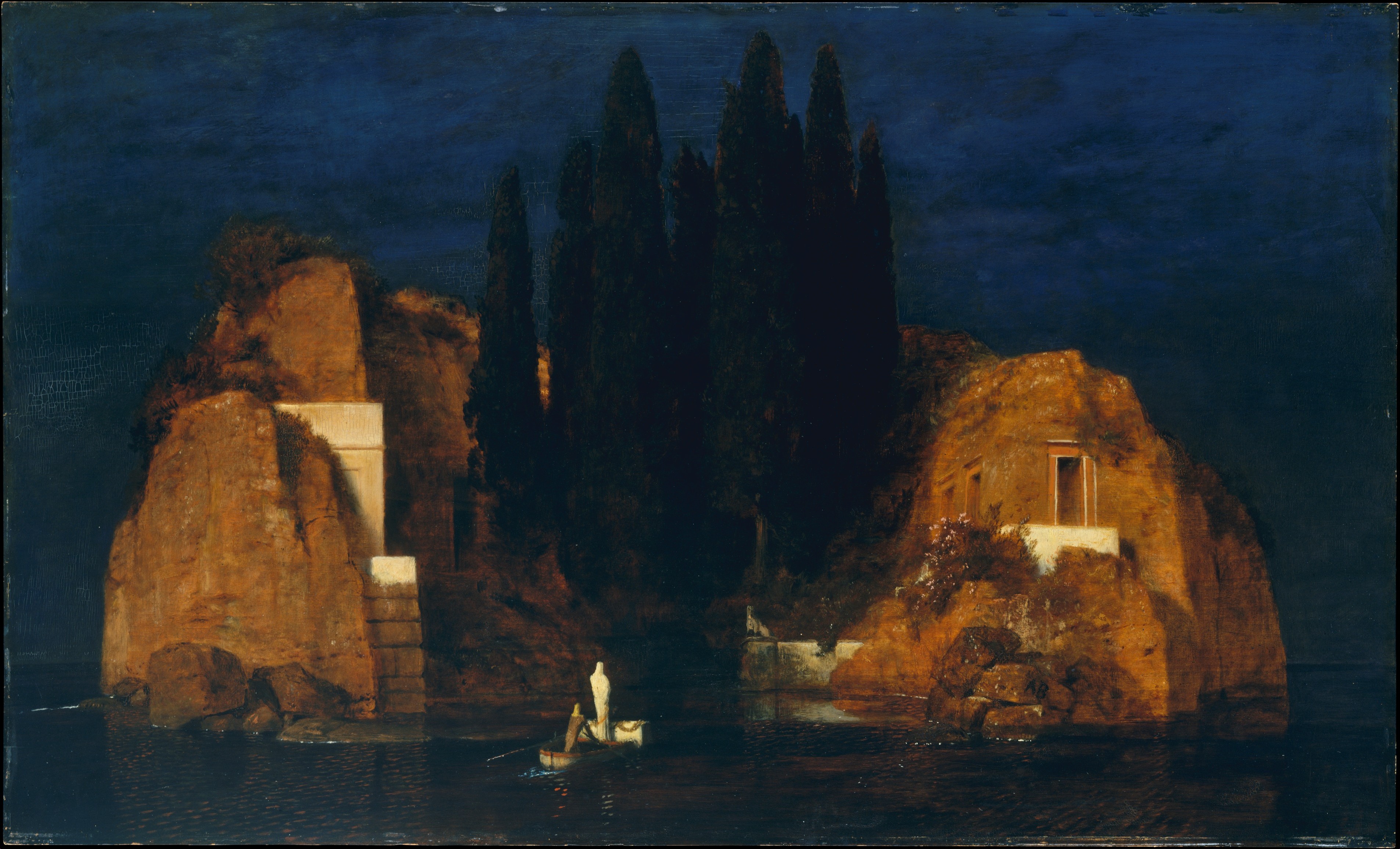
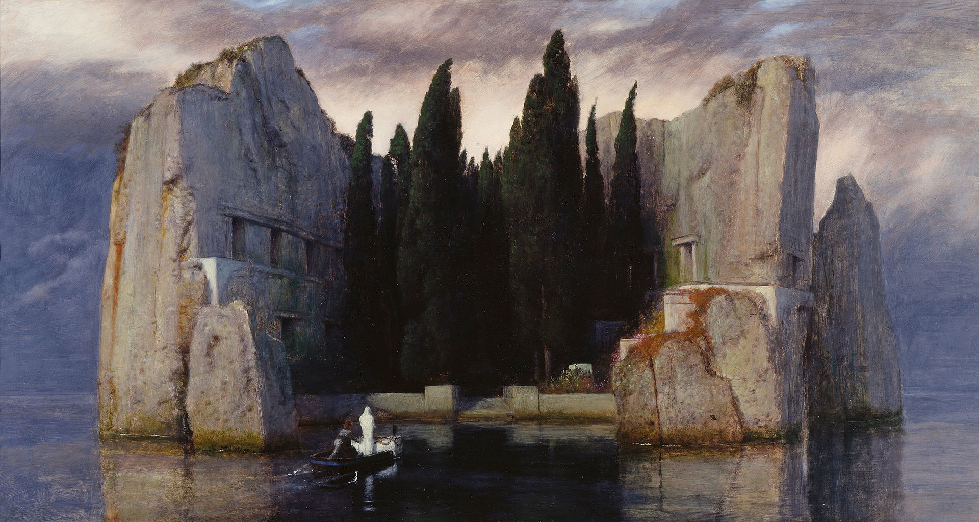
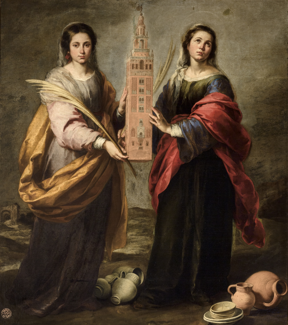
The lives of two young women, thirty years apart and from different cultures are juxtaposed and intertwined in a riveting way, all connected to a work of art: Rufina and the Lion.

Maybe I loved it so much because the main protagonist is a writer, and the pivotal character a painter.

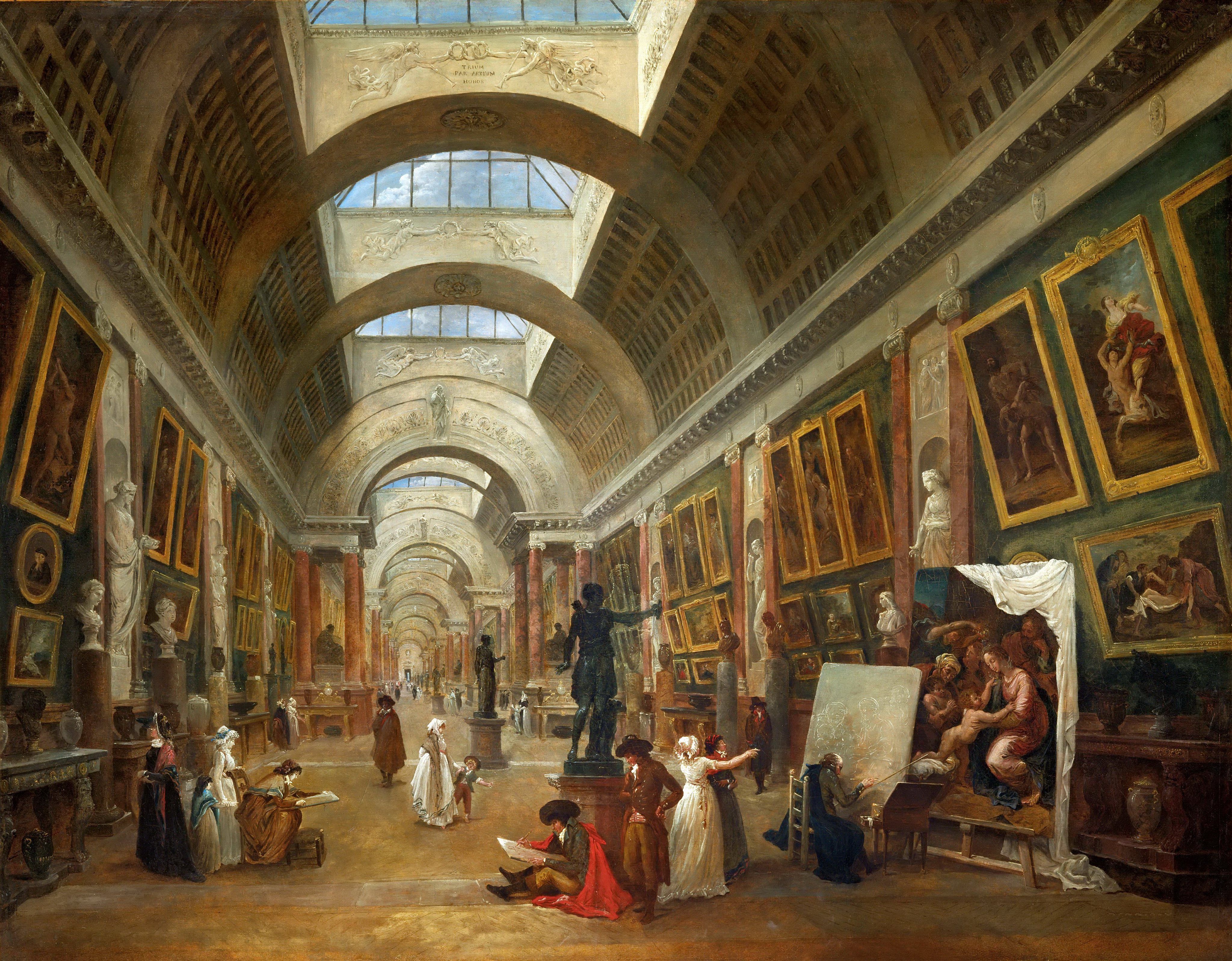
Odelle Bastien, a young woman from Trinidad, struggles to find fulfilling work in 1960s London. The story begins with her getting a new job at a respected London art gallery, The Skelton Institute.

Odelle writes in her spare time and works for the enigmatic Marjorie Quick, bearing witness to her descent into a destructive, downward spiral when Lawrie Scott, (Odelle’s boyfriend), brings a mysterious painting to the gallery for valuation; the only thing left to him by his late mother after her un-timely death. Odelle is determined to get to the bottom of Quick’s secrets.

In a parallel story the novel then jumps back to the past, and the life of the Schloss family who have just moved from London to Andalusia in January 1936. They are renting a large finca in Arazuelo, a village near Malaga.

This image captures how I imagined the Schloss’s rented finca to look.

The father, Harold Schloss, a renowned Jewish Viennese art dealer with a gallery in Paris, becomes obsessed by what he thinks is a work of art by a promising local Spanish artist, Isaac Robles. His wife Sarah is a spoilt and unstable English condiment heiress, and their daughter, Olive, a painter, is coming to terms with her formidable artistic ability.

To her surprise, Olive finds the rural Spanish setting and the presence of their close neighbours, Isaac and Teresa Robles inspires her to express her authentic self. Olive has a letter from the Slade art school in her possession, but she has not shown it to her father, fearing his lack of approval, but also she does not wish to leave Spain and her lover, who also happens to be her muse…

Olive paints in secret, only Teresa is party to her acts of creation. Teresa burns with indignation for her friend’s anonymity – that her talent goes unacknowledged and unappreciated. Her subversive actions on Olive’s behalf are the crucible of how events unfold, of the inevitable apocryphal attributions.  

Olive has a hard time persuading her reluctant muse to take the credit for her art.

“‘Why do you and your sister think I’m so stupid? Do you know how many artists my father sells? Twenty-six, last time I counted. Do you know how many of them of them are women, Isaac? None. Not one. Women can’t do it, you see. They haven’t got the vision, although last time I checked they had eyes, and hands, and hearts and souls. I’d have lost before I’d even had a chance.

‘But you made that painting-’

‘So what? My father would never have got on a plane to Paris with a painting he thought was mine…’”

Jessie Burton, The Muse

Harold Schloss entices Peggy Guggenheim in Venice (a real person and collector) to view the works that he believes are by Isaac Robles.

As Isaac and his younger sister Teresa become deeply involved in the complex dynamics of the Schloss family, they are all ultimately drawn into the Spanish civil war with devastating consequences.

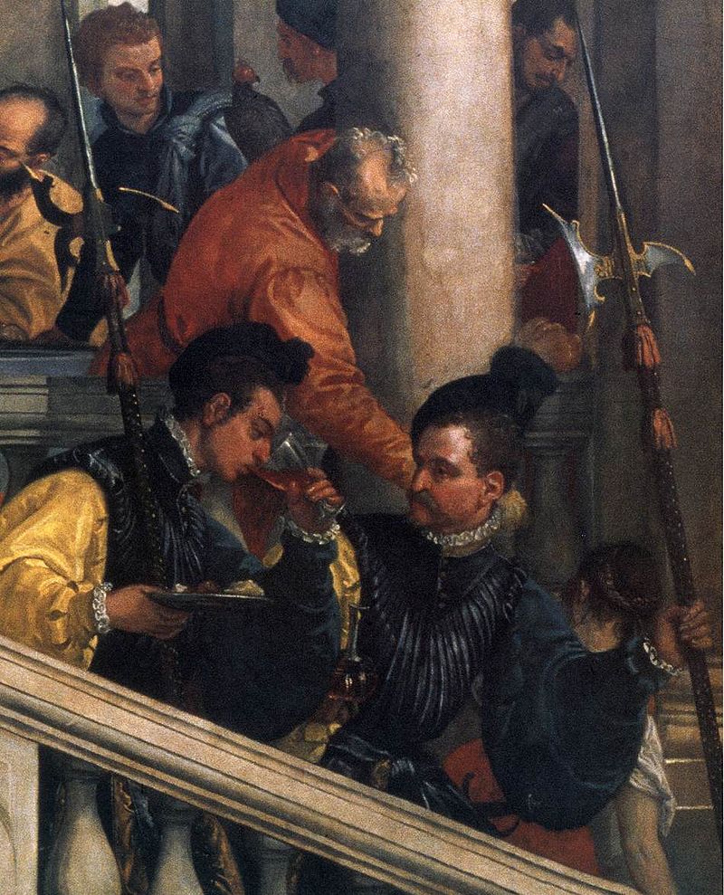
Apart from being a brilliant and beautifully written story, The Muse subtly revealed and revelled in the themes of identity, provenance, the restitution of valuable paintings suspected of being stolen by the Nazis, the circumstances surrounding the creation of art and the cult of the artist.

Saints Justa and Rufina by Murillo

Very often an artist’s appeal and allure increases after their death, although some are fortunate to become legends in their own lifetime. Death certainly creates and intensifies icons…

I’d like to think I’d hang a piece of art mainly because I loved to look at it, not because of who painted it, but very often the two are not mutually exclusive. Rarity adds value, as does sentimental attachment.

The Muse makes you think about what art’s intrinsic value is: the actual work of art itself, which once completed stands independent from the artist, or whether that value should be tied to the person who made it; their story and the ‘journey’ of the work post creation.   

The idea of provenance isn’t unique to the art world, but is also applied in literature, music composition and the purchase of instruments. I readily admit that given the choice, I would love to own a violin made by Stradivarius or Guarneri rather than one produced by an unknown luthier. Their quality has been proven over the centuries.

Maybe time is a factor in how we appreciate art. Trends and tastes change, but geniuses never go out of fashion.

Can we really separate a purely aesthetic desire from financial value?

Any creative endeavour, whether we like it or not, is bound by some degree to the person who originated it.

“I’m doing the absolute opposite of giving myself away. As far as I’m concerned, I’ll be completely visible. If the painting sells, I’ll be in Paris, hanging on a wall. If anything, I’m being selfish. It’s perfect; all the freedom of creation, with none of the fuss.”

Jessie Burton, The muse

Romantic notions tend to creep in when purchasing art and sculpture. We are naturally attracted to the story behind a work of art, it heightens our understanding of it, gives us context to value and appreciate it. Is it right that there may come a point when the provenance or story behind a work is perceived as more important and valuable than the work itself?

Provenance is solely a human benchmark.

I think Banksy was very astute to keep his identity a secret. It’s his trademark signature next to street art that has popped up on a wall or tube train overnight that almost seems to excite people as much as his original pictures…

And what about the artist? What value do they imbibe from their creative efforts?

View of the Grand Gallery of the Louvre by Hubert Robert, c.1796

Certainly they deserve financial remuneration, admiration and respect. Some of these external blessings never flow to an artist. So in many cases the inner joy of creating is paramount. Nothing is certain.

It’s hard to believe that Vincent van Gogh only sold a handful of art works in his life, but now his colourful and distinctive oeuvre is one of the most sought after and popular in the world. How much value did he place in his own ability versus other people’s opinions? Vincent struggled with his mental health, but he was compelled to paint regardless.

Real life scenarios in the art world where a lost masterpiece has been found, and subsequently authenticated, demonstrate how excitement builds and a bidding frenzy usually ensues…

Some amazing stories about lost and recovered masterpieces. And who wishes they had a Renaissance masterpiece hanging on the wall?

For various reasons authors sometimes choose to write under a pseudonym. J.K. Rowling penned the Cormoran Strike crime novels as Robert Galbraith, with modest sales. But once her true identity became public knowledge sales took a startling upward trajectory.

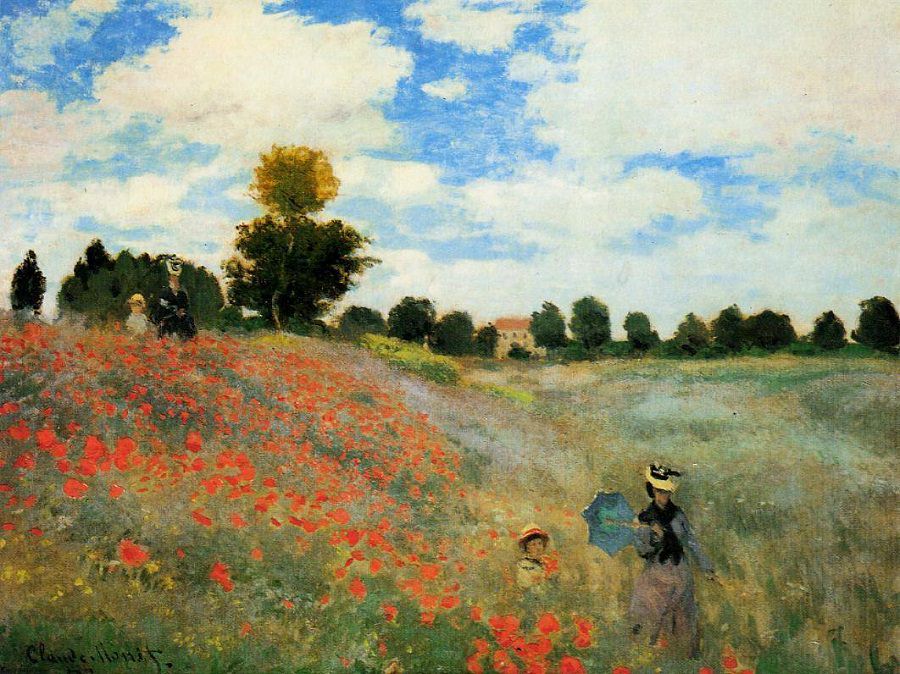
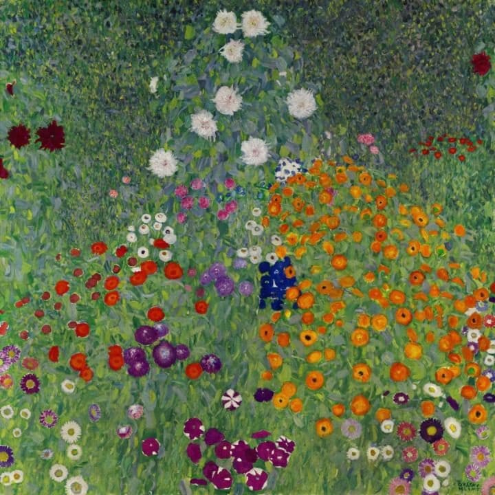
Like writing, art is highly subjective, and we each look at a work of art through our own prism or perceptive lens. Picasso is a big deal, but I don’t personally gravitate to his work. But I love the likes of Monet, Pissarro, van Gogh, Klimt, Alma-Tadema, Waterhouse, and well, I could go on.

In The Muse, Odelle becomes choked up about not being good enough. And who hasn’t experienced Imposter Syndrome to some extent at least once in their life?

Jessie Burton summed up these feelings that can capture and anchor a creative soul on the seabed of writer’s block.

“She had told me that the approval of other people should never be my goal.”

“You’re not walking around with a golden halo beaming out of you depending on the power of your paragraph. You don’t come into it, once someone else is reading. It stands apart from you. Don’t let your ability drag you down, don’t hang it round your neck like an albatross.”

“Like most artists, everything I produced was connected to who I was – and so I suffered according to how my work was received. The idea that anyone might be able to detach their personal value from their public output was revolutionary. I didn’t know if it was possible, even desirable. Surely it would affect the quality of the work? Still, I knew I’d gone too far in the opposite direction, and something had to change. Ever since I could pick up a pen, other people’s pleasure was how I’d garnered attention and defined success. When I began receiving public acknowledgement for a private act, something was essentially lost. My writing became the axis upon which all my identity and happiness hinged. It was not outward-looking, a self-conscious performance. I was asked to repeat the pleasure for people, again and again, until the facsimile of my act became the act itself.”

“…I’d been writing so long for the particular purpose of being approved that I’d forgotten the genesis of my impulse; unbothered, pure creation, existing outside the parameters of success and failure. And somewhere along the line, this being ‘good’ had come to paralyse my belief that I could write at all.”

Jessie Burton, The Muse

My takeaways are that we have to get out of our own way, have faith in our abilities, try to learn from the creative process and above all, enjoy it.

If every artist, writer or musician had decided to quit their projects out of fear of rejection or lack of recognition there would be no culture for us to enjoy, no legacy of human creative expression, no muses to inspire future generations.

“Although any collective answer to my question remains to be seen, personally I feel quite certain of it. Because if there’s one thing I’ve learned, it’s this: in the end, a piece of art only succeeds when its creator – to paraphrase Olive Schloss – possesses the belief that brings it into being. Odelle”

Jessie burton, the muse

What’s in a Painting? Taking a Closer Look at Pieter Bruegel the Elder’s Masterpiece: The Census at Bethlehem (c. 1566)

“You can use a mount of any format you like to cover parts of this extraordinary painting: it will always appear composed. Each element is set out in such a way that, together with the adjacent element, it constitutes a scintillating composition… These seemingly scattered elements could not be more ordered. But this uncanny science is hidden by the work’s engaging nature.  The public does not pay attention to hidden forces.”
~ André Lhote on the Census at Bethlehem (Treatise on Landscape Painting, 1939)

I toyed with the idea of a looking at a Nativity scene for my Christmas masterpiece, and there are certainly plenty of incredible iconic works; but in the end, the more I studied The Census at Bethlehem, the more it related to me on a human level.

Pieter Bruegel the Elder was a Flemish Renaissance Master, an important influence on the Dutch Golden Age, and THE pioneer of winter scenes.

The Census at Bethlehem by Pieter Bruegel the Elder c. 1566

The year before The Census at Bethlehem was completed in 1566, the Netherlands and much of Europe had been in the grip of the coldest winter for a hundred years. Hardships were experienced by the population on a biblical scale; such as famine, disease, riots and a brutal occupation by the Spanish, all of which had hit the population hard.

There was no respite from these seasonal struggles, as the winters in Europe for the next 250 years proved to be among the coldest on record, (certainly harsh enough to justify the ominous phrase, “Winter is coming,” used to great effect in Game of Thrones), leading to that time being dubbed as a ‘little Ice Age’. It was so bitterly cold that even the river Thames froze over, which was recorded for posterity on canvas in 1677 by Abraham Hondius, a Dutch painter living in London.

The Frozen Thames by Abraham Hondius c. 1677

You might expect to see a painting of The Census at Bethlehem depicting the central characters of a pregnant Mary and Joseph to actually be in Bethlehem, the ancestral home of Mary’s betrothed, Joseph – but Bruegel takes his subject and his audience on a journey to the City of David in his Flemish homeland – a snowy Brabant village.

According to the Gospel of Luke 21, 1-5:
“And Joseph also went up from Galilee, from the city of Nazareth, to Judea, to the city of David, which is called Bethlehem, because he was of the house and family of David. In order to register, along with Mary, who was engaged to him and was with child.”

The decree by Caesar Augustus that all citizens be registered is portrayed on this 116 x 164.5 cm oil on oak panel, and by painting this biblical event in a contemporary setting perhaps Bruegel is also commenting on the hefty taxes imposed by the Spanish regime in the Low Countries.

However, it seems that Luke may have taken poetic licence in his gospel:

“The historical problems with Luke are even more pronounced. For one thing, we have relatively good records for the reign of Caesar Augustus, and there is no mention anywhere in any of them of an empire-wide census for which everyone had to register by returning to their ancestral home. And how could such a thing even be imagined? Joesph returns to Bethlehem because his ancestor David was born there. But David lived a thousand years before Joseph. Are we to imagine that everyone in the Roman Empire was required to return to the homes of their ancestors from a thousand years earlier? If we had a new worldwide census today and each of us had to return to the towns of our ancestors a thousand years back—where would you go? Can you imagine the total disruption of human life that this kind of universal exodus would require? And can you imagine that such a project would never be mentioned in any of the newspapers? There is not a single reference to any such census in any ancient source, apart from Luke. Why then does Luke say there was such a census? The answer may seem obvious to you. He wanted Jesus to be born in Bethlehem, even though he knew he came from Nazareth … there is a prophecy in the Old Testament book of Micah that a savior would come from Bethlehem. What were these Gospel writers to do with the fact that it was widely known that Jesus came from Nazareth? They had to come up with a narrative that explained how he came from Nazareth, in Galilee, a little one-horse town that no one had ever heard of, but was born in Bethlehem, the home of King David, royal ancestor of the Messiah.
~ Bart D. Ehrman, Jesus, Interrupted: Revealing the Hidden Contradictions in the Bible & Why We Don’t Know About Them

Certain art historians have sometimes interpreted the pig’s slaughter in political terms. It is feasible to see this as a metaphor for the peasants who were bled dry by excessive taxes levied by Philip II of Spain, which were particularly intolerable during the harsh, famine-ridden winters.

Bruegel must have surmised that the painting would hold greater meaning if the people of 16th Century Flanders could relate to the hope of a better future with the happy and uplifting message of the birth of Jesus if it somehow took place in the heart of their own difficult circumstances.

This magnificent painting is now on display at the Royal Museums of Fine Arts of Belgium in Brussels, a city Bruegel made his home from 1563 onwards. He was also active as a painter in Antwerp prior to his last decade. His pigments were sourced mainly in Antwerp, and were ground in his studio.

The Census at Bethlehem has an abundance of characters going about their chilly business on Christmas Eve, amidst the religious fervour of the birth of Christ, where the Flemish landscape is also a major component. Everywhere you look there is a hive of activity, the freezing landscape is teeming with life.

I like that we have an elevated view onto the scene, with Joseph leading Mary (her face barely visible), perched on her trusty steed (donkey), with an ox in tow, unobtrusively blending into the centre foreground, heading towards the hubbub at the Inn.

The Census at Bethlehem – detail of Joseph and Mary

The gathering of people clamouring to register is surely a hint that there’s not going to be any room at the Inn, even one with a ruling Habsburg crest on the wall.

The Census at Bethlehem – detail of the crowded inn

The lack of decent accommodation, as we know, meant Mary had to give birth to the Saviour in a stable.

I take my hat off to Mary, there was no such thing as Entonox, epidurals, or any pain relief two millennia back, let alone a comfortable bed. Hay might have been okay, but one can imagine it must have been a tad draughty.  I’m not sure I would have coped with a procession of wise men, shepherds and worshippers just hours after giving birth in such circumstances, but thankfully Mary rose to occasion for the sake of humanity!

The perspective in The Census at Bethlehem pulls our gaze towards the bottom left as this appears closer, and the tall tree with the setting sun visible through its high, barren branches seems to demarcate the painting in invisible diagonals from top left to bottom right and bottom left to top right, intersecting in the middle where a single spoked carriage wheel lays in the snow.

The Census at Bethlehem by Pieter Bruegel the Elder c. 1566

Decay and disease is also part of the picture, as a man with leprosy is sheltered in the little hut.

The whiteness of the snow in the centre ground and on the slanting roof tops dazzles against the grey sky and bleakness of unforgiving winter weather, the light in the darkness of winter, as Jesus will become the light of the world.

In the top right we can see a ruined castle, (thought to be based on the towers and gates of Amsterdam Castle), a parallel with the dying of an old belief system, or a Pagan way of life, contrasted with the construction of newer buildings and a church across the frozen river, an allegory for a new religion – Christianity.

The Census at Bethlehem – detail of the castle ruins

Despite the bone numbing cold, many ordinary citizens have ventured out into the snow, from weary travellers to local residents busily preparing for the Christmas mass and celebration.

To think that children over four hundred and fifty years ago were doing just what children would do today, even in the midst of unimaginable cold, generates sympathy with our European ancestors. The joy of skating on ice, throwing snowballs (I loved the touch of white powder stuck to the man’s left shoulder standing with his back to us on the edge of the water), and being generally engaged in wintry play warms your heart.

The Census at Bethlehem – detail of the children

Large barrels of grain are stationary, ready to feed the people with much needed sustenance, even as their souls will be nourished by the coming birth…

The Census at Bethlehem was a popular painting during Pieter Bruegel the Elder’s lifetime, as were pretty much all of his works, which tended to depict the solid, robust and stocky figures of peasants (quite a few engaged in matrimonial and celebratory settings), combining landscapes with ordinary activities, making him an early pioneer of genre painting.

It is said the artist (who would have been categorised as upper-middle class in his day), used to dress as a peasant to gain access to such events and closely observe their activities.

The Census at Bethlehem was copied 14 times, 13 of them were known to be produced by his son, Pieter Brueghel the Younger (spelt conspicuously with an ‘h’); he knew he was on to a good thing! The 14th copy (painted in 1611) caused particular excitement in the art world when it surfaced in 2013 and came to the attention of a respected Old Masters art dealer, Johnny Van Haeften, having been in private ownership for 400 years.

The Census at Bethlehem by Pieter Breughel the Younger

There are subtle differences. The son, a skilled artist in his own right, is bound to stamp his own personality into his art after all, but the most striking for me is the vibrancy of the colour, and it lacks the sunset. It just looks, well cleaner, and not as gritty as his father’s…

Both sons were trained as painters by their maternal grandmother, Mayken Verhulst, a sixteenth-century miniature, tempera and watercolour painter, (hailed as one of the four most important female artists in the Low Countries by Lodovico Guicciardini in 1567), due to the death of their father they were very young. Bruegel’s second son, Jan Brueghel the Elder, differentiated from his brother (who solely focused on replicas of his father’s paintings), with his own original works and became a key figure in the transition to the Dutch Baroque style, frequently collaborating with Peter Paul Rubens.

Pieter Bruegel the Elder (1525–69)

The Painter and the Connoisseur c. 1565 (only known possible self-portrait)

Bruegel was a member of the Antwerp Painter’s Guild. He was known to work by mixing layers that hadn’t dried completely, a technique called ‘alla prima’ or ‘wet on wet’ in English. In contrast to the Flemish artists from the previous century, the light effects are not due to transparency, but the overlay of material and thick impasto brush strokes of colours. This innovation was started by Heironymous Bosch, who was the premier influence on Bruegel, as well as the Italian Renaissance.

In other places, whilst the layers are very thin, Bruegel plays with them to obtain stunning nuances, particularly of the white shades. Bruegel was a master of depicting snowy surfaces and winter skies. Probably his most famous painting is The Hunters in the Snow (c. 1564).  It’s an amazing snowscape that gives a visual gift of desolate beauty and a sense of vast wintry territory in one of the world’s most revered landscapes.

Hunters in the Snow by Pieter Bruegel the Elder c. 1565

Bruegel’s travels to Italy and the influence of the mountainous landscape he would have encountered on his journey in the form of the Alps are juxtaposed against the flat fields of Flanders.

The Hunters in the Snow captures something elemental about our common experience of winter, a deep need for shelter, security and warmth against the stark nothingness surrounding our existence. It also offers the viewer a cinematic position over the first winter landscape created in western art.

I’m shivering just looking at it!

I am reminded of the toughness and resourcefulness of the people of that time, who didn’t have central heating during the ‘little Ice Age’. My brood complained about not having any heating or hot water for five days after our gas combi boiler was condemned a few weeks ago. Woolly jumpers were promptly resurrected from the bottom of drawers.

Bruegel in Vienna this winter…

To commemorate the 450th anniversary of the death of Pieter Bruegel the Elder a major exhibition of three quarters of his surviving work is being hosted at the Kunsthistorisches Museum in Vienna.

Here is a link to his complete oeuvre of ‘Boschian’ allegories, proverbs, religious subjects, landscapes (including human forms) and genre peasant paintings.

Time is rapidly ticking by and I must attend to my brood, plus my usual endless list of last minute preparations, as I am blessed to have all my children together for the first time in a long time this Christmas.

I’d like to take this opportunity to say a big thank you to my readers for the instances you visited or shared my blog in 2018 and wish you all a very merry Christmas and a happy New Year! I hope to bring you some interesting and worthy posts in 2019…

Could this Year be the Perfect, Blissful Summer…?

“My soul is in the sky.” ~ William Shakespeare (A Midsummer Night’s Dream)

It’s been a struggle to find time for my blog lately, what with end of term craziness, juggling my ‘working mum’ balls and looking after ginger tabby kittens Simba and Saffron; plus another exciting project I’m keeping under wraps for the time being.

I feel like a little poetry and an inconsequential natter about the weather might hit the spot. We need something to combat the frequent depressing news headlines about Brexit…

A recent sunset

The ongoing searing temperatures in the UK have been reminiscent of the summer of 1976.  I remember it quite clearly as a slip of a girl: splashing around in the paddling pool with my brother, who to our mum’s dismay, also took an unscheduled plunge into the murky garden pond.

Wow, it’s been a long time since us Brits have really had a decent summer! We always bemoan the drizzly, wet weather that mostly visits our shores, so I have been determined not to complain about the heat. I think we are slowly getting used to it…

Or not.

A selection of recent tweets about #heatwaveuk

The extreme temperatures have been challenging at times, even my computer is whirring grumpily and refusing to operate at its normal speed. Oh well, school is out for summer as of lunchtime today, and my children are officially on manana time.

Summer is symbolic of life, love and abundance. The opening lyrics to Gershwin’s jazz aria ‘Summertime’ from his opera Porgy and Bess springs to mind.

Summertime, and the livin’ is easy… Well, at least it’s meant to be.

Mostly people are more relaxed and tend to be quite sociable; we spend more time enjoying nature and outdoor pursuits. And who doesn’t love alfresco dining on balmy evenings?

My brood have always loved the simple pleasure of picnics and barbecues with friends and family. It’s been so hot lately we’ve been able to take a few refreshing dips in the Wycombe Rye Lido.

I feel like celebrating with a light-hearted mix of music, art and poetry, and perhaps a sip or two of Pimms and lemonade, hic!

Dance at the Moulin de la Galette by Pierre Auguste Renoir

As a mum I also love that my never-ending laundry dries in a nanosecond at the moment!

But can we have too much of a good thing?

Not when it comes to music.

Rimsky Korsakov – Flight of the Bumblebee with the Russian National Orchestra and Mikhail Pletnev:

Mendelssohn – Scherzo from A Midsummer Night’s Dream for clarinet and piano with Alexey Gorokholinsky and Vassily Primakov:

In the summer of 1717 composer Georg Friedrich Händel was commissioned by King George I to write some suitably regal music to accompany his grand flotilla of royal boats as they set sail down the river Thames. The result was his Water Music Suite in F Major, HWV 348 performed by fifty musicians (a large number for the time period), on the banks of the river.

Canaletto – London, The Thames on Lord Mayor’s Day c. 1750

It must have been quite an occasion, one that’s easy to visualise when you listen to the English Baroque Soloists with Sir John Eliot Gardiner:

The Heatwave

Intense heat: blasting, humid, relentless, baking the land,

Verdant, manicured lawns – turning the colour of sand

Butterflies dance and flit among hazy meadows,

Pollen seeking bees casually meander in hedgerows.

Golden Summer, Eaglemont by Arthur Streeton. This was the first Australian Impressionist painting that was sent to Europe for display in London in 1891 and Paris in 1892.

English roses, wild and cultivated, open then wilt,

The cadence of nature’s eternal rhythm and lilt

Soft, sweet flesh of fruits, hastens to ripe,

Even walking makes damp brows to wipe.

The Basket of Apples by Paul Cézanne

Hear the birds, chirping in a chorus of mirth,

Eager to pluck juicy worms from parched earth

Heady scent of honeysuckle hangs in the air,

Long, lethargic days, perfect for a summer fair.

Wild Honeysuckle by Pierre Andre Brouillet

Skin craves the cooling caress of a soft breeze,

Throw off layers, constraints; wander like Uylsses

Seeking adventure across kingdoms, never to yield,

Abundance thrives, opening up a flower filled field.

Poppy field near Argenteuil by Claude Monet c. 1873

Torpid days fade away in vibrant, orangey balls,

Horizons bathed in luminous hues, as darkness falls

My thoughts drift like weightless dandelion seeds,

Scattered. Where they will land? Which will take heed?

Pont Boieldieu Rouen at sunset by Camille Pissarro c. 1896

Summer’s gifts are bountiful; but no rain drops!

Without swimming, drinking or bathing we flop;

Halted, by an unquenchable thirst, dehydrated pores,

Water, wine and crisp cider are liberally poured.

Frederick Carl Frieseke

The last summer I remember as this, was seventy-six,

A young girl was I, unburdened by politics – polemics

Carefree in the garden, to dream of woodland sprites,

Tales by Barrie and Shakespeare create magical nights.

By Virginia Burges

The Adagio from Vivaldi’s Concerto for solo baroque violin and strings in G Minor, ‘Summer’ (L’Estate, RV 315), performed by Cynthia Miller Freivogel and the early music ensemble, Voices of Music beautifully captures the languor of a hot, humid day:

Summer Sun 

Great is the sun, and wide he goes

Through empty heaven with repose;

And in the blue and glowing days

More thick than rain he showers his rays.

🌞

Though closer still the blinds we pull

To keep the shady parlour cool,

Yet he will find a chink or two

To slip his golden fingers through.

🌞

The dusty attic spider-clad

He, through the keyhole, maketh glad;

And through the broken edge of tiles

Into the laddered hay-loft smiles.

🌞

Meantime his golden face around

He bares to all the garden ground,

And sheds a warm and glittering look

Among the ivy’s inmost nook.

🌞

Above the hills, along the blue,

Round the bright air with footing true,

To please the child, to paint the rose,

The gardener of the World, he goes.

by Robert Louis Stevenson

Frederick Delius composed ‘Summer Night on the River’ after being inspired by the sights and sounds of the River Loing, which he would sit and ponder during long evenings from the back of his villa in the village of Grez. The impressionist tone poem recreates the gentle lapping of the waves and boats bobbing in the summer breeze:

Boating on the Seine by Pierre August Renoir

Staying on a nautical theme, Debussy’s En Bateau makes me want to be in and on the water, especially with Fritz Kreisler at the helm!

Anthony Hopkins reads The Lake Isle of Innisfree by W.B. Yeats:

The Poppy

Summer set lip to earth’s bosom bare;

And left the flushed print in a poppy there:

Like a yawn of fire from the grass it came,

And the fanning wind puffed it to flapping flame.

By Francis Thompson

Maurice Ravel’s iconic ballet Boléro, with its hypnotic drum beat and mesmerising flute melody, building up slowly and deliberately to a dramatic conclusion is perfect for sultry summer nights.

Ravel worked on Boléro over the Summer of 1927 at the behest of the Russian actress and dancer, Ida Rubinstein. Here is a wonderful ballet version choreographed by Maurice Bejart with Nicolas Le Riche and orchestre de Paris:

I can’t end without the bard’s immortal Sonnet No. 18 – Shall I compare thee to a summer’s day? Tom Hiddleston’s velvet voice was meant for Shakespeare:

Have a fabulous, sizzling summer!

What’s in a Painting? Taking a Closer Look at Théodore Géricault’s Masterpiece: Raft of the Medusa (c. 1818-19)

“The truly gifted individual does not fear obstacles, because he knows that he can surmount them; indeed they often are an additional asset; the fever they are able to excite in his soul is not lost; it even often becomes the cause of the most astonishing productions.” ~ Théodore Géricault

The Raft of the Medusa is not an easy painting to study or appreciate, but it deserves our attention; for we can learn much from the real-life tragic event that inspired it, as well as the feverish dedication and skill with which it was painted.

Measuring a whopping 23 by 16 feet, this epic oil on canvas masterpiece now hangs in a gallery near the Mona Lisa in the Louvre, Paris.

Le Radeau de la Méduse was Théodore Géricault’s most famous and shocking work of art.

Le Radeau de la Meduse by Théodore Géricault c. 1818-19

The Raft of the Medusa portrays a brief moment of euphoria as the men on the raft spot another ship in the distance, hoping and praying to be rescued after thirteen horrific days at sea. The Argus can only just be seen on the horizon.

You can almost hear the men’s hoarse cries in an attempt to draw attention to their desperate plight, mustering their last ounce of strength to shout and wave a stained, ripped shirt. This is their last chance of survival…

Théodore Géricault, a courageous, passionate, Romantic era French painter and lithographer, sadly passed away from tuberculosis at the tender age of thirty three. Géricault didn’t live long enough to see his paining achieve its greatness, but that seems to be the way of things for many artists and creatives.

Probably the ghost of Vincent van Gogh would be flabbergasted (but happy), to know the sums of money passing hands for his prized paintings; or of his universal popularity and posthumous fame. Yet of the prolific oeuvre of 900 paintings he produced in his lifetime, he sold only one:  Red Vineyard at Arles.

It is a curious phenomena. Many artists, composers and writers were under appreciated or misunderstood in their prime… In the spirit of originality they were simply being true to themselves, following their inner compass, regardless of the trends, thoughts and fashions of the time.

Who knows what Géricault might have produced had he been gifted with a few more years to bestow his artistic talent on the world. But in my humble opinion he has earned a place at the table of the greats with this heart-rending work.

The Raft of the Medusa depicts the harrowing and calamitous historical outcome of the ill-fated voyage of the French Navy’s forty gun Frigate Méduse, carrying around 400 passengers (including the new Governor and his wife),  plus various French officials who were en-route to reclaim Senegal from the British.

Wreck of frigate Méduse

The Méduse ran aground on the Bank of Arguin off the coast of Mauritania in the summer of 1816. The shipwreck and its raft tragedy elicited considerable public emotion, making Méduse one of the most infamous shipwrecks of the Age of Sail.

An incompetent captain

Viscount Hugues Duroy de Chaumareys was installed as ship’s captain by King Louis XVIII in a political manoeuvre because of his support for the monarchy after the Bourbon Restoration.

Louis XVIII of France in Coronation Robes by Francois Gerard

The king overlooked the fact that he had hardly sailed for twenty years, and was clearly unsuitable for the posting. It was an act of unparalleled hubris by the French monarch, as Monsieur de Chaumareys proved himself to be incompetent and grossly negligent for the unnecessary deaths of many of his passengers and crew.

The Méduse was not the first vessel to not carry enough lifeboats for all its passengers, and sadly it has not been the last. There were only enough lifeboats to accommodate 250 passengers on the voyage should the need arise. And arise it did.

In his attempt to impress the new governor and important guests, the captain sailed too fast and too close to the shore (ignoring the warnings of a senior crew member), in his bid to arrive at their before the accompanying vessels. Inevitably, the Medusa struck a large sandbank.

Perhaps the ignominy made too big a dent in his pride, as de Chaumareys refused to offload the heavy cannons on board the Méduse so she could be re-floated. Another unconscionable decision with others to follow that would cost more lives.

Stranded off the West African coast, the Méduse listed helplessly. Initially, it was decided that the lifeboats would make two return runs to shore (around thirty miles away) in order to get everyone to safety, and a raft was hastily built, twenty metres long and seven metres wide, to transport the ship’s cargo.

Raft of Méduse at the moment of its abandonment by Alexandre Corréard

However, inclement weather whipped up a storm that hit them on 5th July 1816 and the captain, fearing the Méduse would break apart, gave the order to abandon ship. Seventeen soldiers and crew remained on the ship in order to protect her cargo, while 250 passengers were placed in the lifeboats and 147 souls were packed like sardines onto the raft, which was being towed by the lifeboats.

Human nature always seems to be either at its worst or its best during times of crisis, and there does not appear to be any signs of heroism emerging from this particular historical debacle.

The people in the lifeboats (perhaps fearing for their own lives), cut the ropes towing the raft after a bit, and with barely any food, drink or life sustaining supplies and no way of steering or navigating, the raft drifted into the swell of the Atlantic…

The apparent cruelty and callousness with which they were jettisoned by the passengers in the lifeboats would unleash hellish conditions and unbridled panic on the unfortunate men (and one woman) clinging to the raft, as they rapidly perished through drowning, starvation, suicide, disease, fighting and murder.

Although shocking, it’s probably not surprising that some of them eventually resorted to cannibalism.

The centre of the raft was the safest place and violent attacks broke out as the men clambered and fought to be away from the exposed edges, the prowling sharks and the unforgiving waves…

After thirteen days of being tossed around at sea, one of the accompanying ships, the Argus, saw and subsequently rescued the survivors from what was left of the raft. They found only fifteen men left alive from the 147, and a further five of these died when they reached land, including the last African crew member, Jean-Charles.

Suddenly, here was a historical painting not of heroic deeds, not drawn from ancient Greek or Roman mythology, but of real people struggling with a contemporary disaster, shown to the French nation in the form of Géricault’s brutally visual social commentary on the tragedy.

To add insult to injury de Chaumareys sent a salvage crew back to the Méduse to recover her cargo of gold. The ship had not been broken apart as he had thought, but remained intact, with only three of the seventeen men who stayed aboard still alive after fifty four days.

During his court martial in 1817, de Chaumareys was acquitted on three counts: of abandoning his squadron, of failing to re-float his ship and of abandoning the raft. However, he was found guilty on two counts: of incompetent and complacent navigation and of abandoning the Méduse before all her passengers had been taken off.

The verdict carried a potential death penalty, but de Chaumareys was sentenced to only three years in jail.

However, I do feel the British must have had their fair share of bumbling idiots put in unsuitable positions of power and responsibility by favour of royal or noble patrons, without due consideration to the consequences of their actions.

Even though The Raft of the Medusa must have highlighted further the embarrassment and subsequent attempt to cover-up the shipwreck by the French monarchy, its sizeable depiction on canvas was nonetheless displayed at the prestigious Paris Salon in 1819.

Raft of the Medusa shown in Salon Carre of the Louvre depicting Gericault’s painting on display by Nicolas Sebastien Maillot c. 1831

King Louis XVIII commented: “Monsieur Géricault, you’ve painted a shipwreck, but it’s not one for you.”

Its grisly, visual storytelling wasn’t so far removed from the tenets of the Romantic Movement: to arouse emotions, feelings and passion; reacting against cool, hard logic and depicting individuals in peril. Although Romantic in genre there is still an element of Classicism in the work.

The underlying theme of Romanticism was that not everything could be understood.

“Feel the forces of nature in all of their grandeur and power so you feel insignificant. Only then can you feel part of something bigger.” ~ Edmund Burke

People were smaller parts of a larger, mysterious whole; usually painted at the mercy of the forces of nature in wild and untamed landscapes.

Romantic art works were designed to make people feel overwhelmed, and I think when we look at this painting, the best word to describe the Raft of the Medusa is overwhelming….

Géricault grafted and crafted a work that was overwhelming in subject matter beyond anything that had been painted by anyone before.  It confronts us with strongly visceral material: physical, mental and emotional suffering, all the more poignant for its tiny element of hope.

Despite the painting’s similarities with the historical event it portrays, there are notable differences. For all its authenticity, Géricault may have decided to heighten the drama for aesthetic considerations. There are more people on the raft in the painting than there were left in real life, and the weather was sunny and calm on the day of the rescue, not brooding and stormy. But we’ll forgive him for taking such artistic licence!

“With the brush we merely tint, while the imagination alone produces colour.” ~ Théodore Géricault

The entire Raft of the Medusa project was completed by Géricault in eighteen months.

The right hand triangle of tangled, contorted bodies is crowned by a black man, waving a makeshift flag at the ship on the horizon. Perhaps he was also commenting on slavery, as well as the desire to survive, for Géricault was an Abolitionist.

The scene is dark, it does not hide the madness, desperation and death that these souls experienced, but Géricault still manages to impart some aesthetic beauty into the work. The figures are obviously Baroque in their physical appearance, muscular and of the type you might see in a painting by Peter Paul Rubens (who was a major influence on Géricault).

The lighting is somewhat “Caravaggesque”, after the Italian artist closely associated with tenebrism—the use of violent contrast between light and dark.

It could be said that there is also the influence of Michelangelo if you study the detail of the underworld from his immortal Renaissance masterpiece, the Last Judgement on the Sistine Chapel.

Detail of The Last Judgement by Michelangelo

“Michelangelo sent shivers up my spine, these lost souls destroying each other inevitably conjure up the tragic grandeur of the Sistine Chapel.” ~ Théodore Géricault

A literary influence is also prominently on display in the painting, Géricault’s clever way of making the viewer question what they would do in a similar situation. He does this by depicting a character from a well-known story to his audience of the time: Count Ugolino from Dante’s Divine Comedy.

It is thought he ‘borrowed’ the image from a painting of Ugolini by Henry Fuseli (1741–1825).

Ugolino and his sons starving to death in the tower by Henry Fuseli c. 1806

We see the dolorous, mature, grey haired man, red scarf draped over his head, his right elbow on his knee, sitting hunched in grief and resignation with his left arm resting over his dead son.

Géricault is asking us through these figures representing Count Ugolino and his lifeless son: is hunger stronger than grief?

In Inferno, Dante writes that the prisoners were slowly starved to death and before dying Count Ugolino’s children begged him to eat their bodies.

“’Father our pain’, they said,
‘Will lessen if you eat us you are the one
Who clothed us with this wretched flesh: we plead
For you to be the one who strips it away’.
(Canto XXXIII, ln. 56–59)


“… And I,
Already going blind, groped over my brood
Calling to them, though I had watched them die,
For two long days. And then the hunger had more
Power than even sorrow over me”
(Canto XXXIII, ln. 70–73)
Research above and beyond the call of duty!

In his quest to make an impact and accurately depict the events that took place on the raft of the Medusa, Théodore Géricault first read damning newspaper accounts in the Journal des débats which appeared on 13 September 1816, then contacted two survivors from the shipwreck: the cartographer Alexandre Corréard and surgeon Jean-Baptiste Henri Savigny.

They had co-written a book about their ordeal and agreed to meet him and relay their traumatic experiences. He put them up in his home during this time.

Géricault learned that the ship’s carpenter had also survived, and duly invited him to build a smaller scale replica of the actual raft in his studio. He was then able to study the perspective of a realistic scene for his epic painting.

Portrait of the Carpenter on the Méduse by Théodore Géricault

And if you didn’t think that that was enough, he also visited the morgue to sketch and study corpses and cadavers, so that he could accurately portray their lifeless, pallid expressions and complexions.

Géricault  even took the unprecedented step of bringing body parts back to his studio to paint. The stench of putrid flesh must have been overwhelming, not to mention the most unpleasant and macabre nature of this undertaking.

Study of body parts in preparation for the Raft of the Medusa

That he went to such lengths over this painting is almost incomprehensible.

Preparatory work of The Raft of the Medusa by Théodore Géricault

Composition and structure

The majority of the raft’s inhabitants are arranged in two pyramid type structures along with the small sail, while the open space at the forefront of the raft makes it seem closer and invites us to step aboard if we dare…

The way the light shines and reflects on the living (and dead flesh), in a brief moment of euphoria as they spot a ship on the horizon is really quite eerie. The large wave on the left threatens to engulf them all before they can be rescued, their situation is still precarious. The sun’s rays illuminating the sky from beyond the horizon offsets the foreboding dark clouds. There is not much left of the raft itself at this stage.

French Romantic painter Eugène Delacroix posed as the dark haired figure lying face down at the front of the painting with his arm stretched out in front of him.

Delacroix was a friend and admirer of Géricault, and later painted his famous Barque of Dante along similar thematic lines.

“Géricault allowed me to see his Raft of Medusa while he was still working on it. It made so tremendous an impression on me that when I came out of the studio I started running like a madman and did not stop till I reached my own room.” ~ Eugène Delacroix

The Barque of Dante by Eugène Delacroix

The raft of the Medusa was exhibited in London in 1820 at William Bullock’s Egyptian Hall in Piccadilly, London, from 10th June until the end of the year, and was seen by around 40,000 visitors. It proved more popular in London, partly because it was hung low to the ground (unlike at the Salon where its high position lessened its monumental impact).

Influences on Géricault for The Raft of the Medusa

French contemporary artists that would have left their mark on Géricault and influenced his approach and execution of the Raft of the Medusa, were Jacques-Louis David, Antoine-Jean Gros and Pierre-Paul Prud’hon.

From Wikipedia:

Several English and American paintings including The Death of Major Pierson by John Singleton Copley (1738–1815)—also painted within two years of the event—had established a precedent for a contemporary subject. Copley had also painted several large and heroic depictions of disasters at sea which Géricault may have known from prints: Watson and the Shark (1778), in which a black man is central to the action, and which, like The Raft of the Medusa, concentrated on the actors of the drama rather than the seascape;

Watson and the Shark by John Singleton Copley

The Defeat of the Floating Batteries at Gibraltar, September 1782 (1791), which was an influence on both the style and subject matter of Géricault’s work; and Scene of a Shipwreck (1790s), which has a strikingly similar composition. A further important precedent for the political component was the works of Francisco Goya, particularly his The Disasters of War series of 1810–12, and his 1814 masterpiece The Third of May 1808.

Jean-Louis André Théodore Géricault (1791 – 1824)

Born in Rouen to a wealthy family, young Theo was first educated in his art by the painter Carle Vernet, in the sytle of English sporting art. Many of his earlier works were mostly of horses or with a military theme, and sometimes combined both.

Théodore Géricault in his studio c. 1818

He was allowed to paint the magnificent horses in their stables at Versailles. Pierre-Narcisse Guérin taught him classical figure composition, but Géricault decided to self-direct his education at the Louvre from 1810 to 1815, copying works by Rubens, Titian, Velázquez and Rembrandt.

His last works were a series of ten paintings of the insane, the patients of a friend, Dr. Étienne-Jean Georget, a pioneer in psychiatric medicine, with each subject exhibiting a different affliction. Five are known to have survived, including the Insane Woman. ‘Les monomaniacs’ portraits are subtle and brilliantly nuanced.

Interesting history of the artist by Dr. Christian Conrad:

In addition to his influence on Delacroix, Géricault’s work had an important effect on Edouard Manet and the future impressionists. JMW Turner even strapped himself to the mast of ship to experience being out in a storm in the quest for authenticity!

Géricault could be considered the pivotal founding figure of modern art.

The event and the painting inspired the German composer Hans Werner Henze, who wrote a suitably epic oratorio on the subject, Das Floß der Medusa.

The powerful presence and authenticity of this work; its scope, its grisly subject matter and enthusiastic, atmospheric rendering will ensure the Raft of the Medusa remains in the cannon of humanity’s greatest art works.

All I can say is I’m glad I wasn’t there! Thankfully lessons were learned from this tragic episode of French Maritime history. The Gouvion de Saint-Cyr Law ensured that promotions in the French military would thereafter be based solely on merit.

“Our whole society is aboard the raft of the Medusa.” ~ Jules Michelet

Top 5 Tips on How to Teach Modern Art in Colleges: Guest Blog by John Landrum

Teaching is a noble occupation.

In ancient times, there were few teachers and those who chose this profession were honorable members of society. Now, a lot of university graduates step on the teaching path, and many of them are involved in art education.

Teaching art cannot be easy: modern artists are unstoppable in producing original and extraordinary masterpieces. Sometimes it can be difficult to make students understand modern tendencies and comprehend artsy styles. Thus, we prepared hot five advice on how to teach art classes in college.

  1. Keep it simple

Modern art is complicated to apprehend. Artists tend to use incompatible colors, forms, and patterns to express their energy, thoughts and feelings. Not surprisingly, it is tricky to convey the “message” of the artist to students.

Simplicity is the key to everything. A very confusing idea can be explained in a simple way. To do that avoid creating a story from a single art element. If the painting is all about messy colors and chaotic lines, it means nothing but messy colors and chaotic lines. Don’t imagine additional meaning if there isn’t one. Some masterpieces don’t have to be understood.

  1. Let your students think

Many teachers have an individual approach to explaining art. They tend to dissolve the concept and analyze it thoroughly. But this approach isn’t effective for modern education. To make learning more exciting for students, you should allow them to contemplate and perceive art their way.

Make them think about what they see and how the image affects their conscience. Ask what feelings and emotions they are having when analyzing some modern sculpture or exhibit. Make their mind work and reconsider their opinions.

  1. Visualize

Technologies are great at making any education more apprehensible. Presentations, diagrams, and videos have to be included in your art classroom management. They ease the perception of any concept and make students memorize better.

Browse some art-house films and include them in the plan of your lecture. Ask students to take part in the educational process creating PowerPoint presentations and mini-movies about current culture tendencies. They will enjoy the creative procedure and research new information. Also, provide students with opportunity to choose a topic for a presentation they are interested in. Thus, they will be eager to do the home task and present their personal opinion on the issue.

  1. Leave the classroom

The old standard way to conduct lessons in classroom is a bit old-fashioned. When it is about art, you have to leave the stereotypes behind and break the mold.

There are many places where every person can become closer to modern culture. Make your students visit with local museums, exhibits, and performances. Give classes in artsy places, free spaces, galleries, and antique shops. The unceremonious atmosphere will ease understanding of modern culture tendencies.

  1. Engage students in artsy activities

If students decided to take art or culture classes, they probably have creative personalities. Why don’t use this fact in teaching?

Engaging students in the creation of artsy projects, you can help them reveal and develop their skills. Give them a chance to become part of creation process. Instead of assigning boring essays, make up something different. Bring bright watercolors, charcoals, and Crayola and engage students in a big project.

Make them open their personalities and show their hidden talents.

And the last advice for every teacher: be kind. Kindness opens hearts to the knowledge. Whether it is art or history you teach, give your students opportunity to express their minds and learn freely. Every opinion has a chance to exist.

 John Landrum is an enthusiastic writer for https://essayvikings.com/. Having graduated from Queen Mary University, John keeps in touch with his professors. This successful man has a colossal amount of teaching experience. He loves being a part of the educational system and bringing changes in everyday academic routine. John is an active member of Internet society: he shares his working experience with colleagues. He is a real bookworm and cannot pass any bookshop without getting a new textbook. John is a very inspiring person and his favorite saying is “Out of difficulties grow miracles”. 

What’s in a Painting? Taking a Closer Look at Gerard ter Borch the Younger’s Masterpiece: The Gallant Conversation (c.1654)

“The whole idea of women seen in a moment of contemplation, that stillness we like in Vermeer: they essentially come from Ter Borch. The idea of unresolved social interactions – that’s also very Ter Borch. He invented that.” ~  Adriaan E Waiboer (Art Historian)

Quite by accident I stumbled upon the work of Gerard ter Borch, and I was captivated by his unique and innovative style.  It is perhaps one of the greatest injustices in the history of art that Gerard ter Borch has been a largely overlooked Baroque Master of the Dutch Golden Age.

It’s high time that Gerard ter Borch is awarded the widespread credit he deserves, not just from a select group of specialists and connoisseurs. In my humble opinion he deserves some of the adulation that continues to be heaped on his more famous, younger contemporary, Johannes Vermeer.

The Gallant Conversation (previously Paternal Admonition) c. 1654

Painted when ter Borch was 47 years old, this oil on canvas masterpiece is now housed in the Rijksmusem in Amsterdam and measures 71 x 73 cm.

There are several reasons why I picked this particular painting of ter Borch’s: the main one being it rather mesmerises me…

It also challenges one’s perceptions with its psychological complexity. It is inherently ambiguous.

The first thing my eyes are drawn to is the woman’s sumptuous, silvery satin garment; the incandescent heart of the painting that radiates onto our retinas. The folds, creases and shadows on the long skirt are so exquisitely rendered, I want to stretch my hand out and stroke the silky material between my thumb and fingers.

It is sensual and utterly sublime. The shine, shade and texture of her dress takes my breath away. It looks so real I expect to hear a faint rustle as she moves or walks.

The way the light reflects on the satin fabric contrasts dramatically with the black velvet covering on her upper back and shoulders and lace back, as well as the more muted colours of the other two people and the dark background, forcing your gaze onto the transaction between the three protagonists.

In this way Ter Borch directs our attention to the inner lives of the subjects in their home or another everyday environment.

Ter Borch displayed an admirable ability to capture private scenes of human drama – men and ‘juffertjes’ (young ladies), in their beautiful gowns, captured in typical 17th century bourgeois settings.

The subjects of his genre paintings are usually involved in various activities, such as singing or making music, reading or writing letters, or hinting at more intimate pastimes, (as is the case with The Gallant Conversation). 

Because The Gallant Conversation is painted with such subtlety, and the setting is so cleverly nuanced, it encourages the audience to speculate as to its true subject.

It is believed by Ter Borch’s biographer and other scholars to actually depict an amatory negotiation between a soldier, a prostitute and her procuress inside a brothel.  Probably the large, reddish wooden bed behind the figures is a bit of a giveaway, as well as the objects of feminine beauty on the table to the left of the woman; especially the rather elaborate mirror and the trailing pale ribbon.

I love the way the silver bowl and candle holder glint in the parsimonious light of the foreground.

It is as if Ter Borch is being not only a skillful, but also a rather gallant painter, protecting the woman’s honour by deliberately not showing us her face. Instead he has shielded her identity and hints at her beauty and profession by the splendour of her clothing, her translucent neck, and carefully arranged hair.

Detail of The Gallant Conversation by Gerard ter Borch

The military officer is addressing the courtesan, and the older lady seated next to him appears to be contemplating his words as she sips her wine. Could there have been a coin held in his raised right hand?

Although his uniform is not as dazzling as the woman’s sleeves and skirt it still impressive: the flecks of gold in his ribbed sleeve, the degrees of gold shading of his tunic and the material tassels hanging from his outer trouser, the yellow and blue plumage in his hat that rests on his right knee; down to the detail of the nails on the sole of his right boot placed nonchalantly across his left knee. His sheathed sword is still attached to his belt.

To me his facial expression is rather enigmatic, but perhaps hints at his desire with a self-assured countenance.  The red velvet chair he is sitting also elevates his importance as a customer.

The expression of the mangy cur behind him is pitiful, his dark eyes pining for affection and food.

The dark clothes of the madame and her less prominent facial features and the surrounding sparsely furnished room is of less importance than the young man and woman. The scene, though tastefully done, is reminiscent of the somewhat tawdry task of agreeing and conducting the business end of a supposedly loving, passionate and physical deed.

Ter Borch has shown sensitivity to a ‘transaction’ preceding a sexual act, and leaves you to imagine the old woman placing her glass on the red tablecloth having agreed the price, and silently leaving the room.

The soldier may then remove his sword and outer garments. Perhaps he will undo her corset first, or he may slowly raise her luxurious, satin gown to touch her stocking clad ankles…

Paternal Admonition

The idea that the couple could have been the young woman’s parents originated with Goethe, after he viewed a copy of the painting by the artist on display in Berlin. But to my eye the male figure is clearly too young to be her father.

The Gallant Conversation copy by Gerard ter Borch in the Gemaldegalerie Berlin

In his “Die Wahlverwandtschaften” Goethe notes the delicacy of attitude of the figures. He remarks how the father quietly and moderately admonishes his daughter who is seen from behind. The woman next to him Goethe interprets as the young woman’s mother, who lowers her eyes so as not to be too attentive to the ‘father’s admonition’. This moralising title, however, is without foundation and does not conform with Ter Borch’s usual themes.

That Goethe’s interpretation was possible at all shows the refinement of Ter Borch’s treatment. Even if he made a mistake, Goethe had the right feeling for the way Ter Borch treated his subjects. In the Berlin painting the coin had been rubbed away, perhaps to erase its offending implication?

Psychologically and pictorially he retains a masterful touch and delicacy.

Gesina: model and muse

It is most likely Ter Borch’s beautiful half-sister Gesina, who is posing as the woman in many of his works. He sketched and painted her extensively in the late 1640s and early 1650s. Perhaps his most innovative and stunning painting of her is Woman at a Mirror (c.1650).

Woman at a Mirror by Gerard ter Borch c. 1650

In this remarkable painting we see a simultaneous view of the woman’s front and back:  her soft facial features gaze up from her reflection in the looking-glass, and from behind her expensive dress, embroidered with gold braiding glimmers beneath her alabaster shoulders – a vision of luminosity…

It also contains the two elements of Ter Borch’s typical modus operandi: a beautiful young lady, brightly lit against a dark background, predominantly seen from behind wearing lush, satin garments.

Gesina is also featured in full-length panel, A Young Woman at Her Toilet with a Maid (c. 1650), at home these days in the Metropolitan Museum of Art in New York.

A Young Woman at a Toilet with her Maid by Gerard ter Borch c. 1650

Perhaps if the Gallant Conversation were painted today it would be titled: Indecent Proposal!

Ter Borch’s skill in creating an image so compelling and yet so ordinary blows me away. He manages to elevate a scene essentially considered carnal in nature: prurient and potentially crude, and elevates it to a work of art, to something that could be hung in front of visitors and relatives in civilised circles.

Copies

Gerard ter Borch made numerous copies of The Gallant Conversation, each similar yet a little different. Aside from Ter Borch’s own copies, it is the most widely copied work by a Dutch artist, with some 24 copies said to have been created by various artists.

Copy of The Gallant Conversation after Gerard ter Borch by Charles van Beveren – Amsterdam Museum

If imitation is a compliment then the work certainly drew many admirers!

“It’s clear that without Gerard Ter Borch, there would be no Vermeer.” ~ Waiboer
Gerard ter Borch (1617 – 81)

Gerard ter Borch the Younger was born in Zwolle, son of a successful painter, Gerard ter Borch the Elder, who naturally taught Gerard junior the rudimentary skills of his trade.

Gerard ter Borch, Self Portrait c. 1668

A precocious talent, his father had proudly kept an early sketch of horseman drawn by his son at the tender age of seven.

In 1635, barely eighteen, ter Borch went to England where he worked in his uncle’s London studio. Artistic talent ran in his family; his uncle, Robert van Voerst, was then the royal engraver to King Charles I.

During his apprenticeship in London his father sent him a chest full of clothes and art supplies, including a mannequin, accompanied by a letter of instructions:

“Use the mannequin and do not let it stand idle. Draw a lot: large, dymanic compositions.”

It seems his father knew what would be in vogue in the baroque European courts. In his lifetime Gerard ter Borch II became one of the most renowned artists of the Dutch Golden Age. Ter Borch’s oeuvre consists mainly of portraits and genre paintings.

In 1640 Ter Borch travelled south and spent time in Rome, and from 1646 he lived for a few years in Münster, Westphalia during the peace congress. His masterpiece from this event, completed in 1648, was The Swearing of the Oath of Ratification of the Treaty of Münster, (in the National Gallery in London), portrays the delegates of Holland and of Spain assembled to sign the peace treaty.

Ratification f the Treaty of Munster by Gerard ter Borch c. 1648

He was moving in powerful, influential circles by the time he reached his early thirties; his artistic services were in demand by the aristocratic elite of Amsterdam, and commissions came from nobles and monarchs across Europe – including William of Orange and Cosimo III de’Medici.

By 1650 he was paining in Madrid, where it was rumoured he painted a portrait of King Philip IV. An astonishing achievement if it happened – an unknown young Dutchman making a portrait of a Spanish monarch.

In 1655, rather than setting up his studio in the bustling cities of Amsterdam and Delft, Ter Borch finally chose to settle in Deventer, and married his step-mother’s sister.

In his earlier years he painted many guardroom subjects in the manner of Pieter Codde and Willem Duyster, but later, from about the time when he eventually made a home in Holland, he painted stunningly drawn small groups, posed easily and naturally against shadowy backgrounds and imbued them with an almost aristocratic elegance that was unique among Dutch painters of his time.

“Clearly Ter Borch was comfortable dealing with people of elevated status. In that sense, he was a bit of a small Rubens, rather than this artist from the countryside who happened to be amazingly influential. He travelled an enormous amount, knew how to use a knife and fork, had connections. And that must have made a huge impression on Vermeer.” ~ Adriaan E Waiboer

Influence of Vermeer (1632 – 75)

Gerard ter Borch was creative and avant garde in his concepts, he invented the style of pictures that Joahannes Vermeer successfully developed with his own ‘lighter’ style that remains popular today.

Contrary to Vermeer’s paintings, the dim light and the subdued chiaroscuro of Ter Borch do not allow a complete grasp of the whole field of vision. The light comes mostly from the front and stops at the glossy surfaces of the costumes and other textures.

Art historians have discovered compositional sources for almost all Vermeer’s works. It seems he kept an eye on what his peers were producing, and borrowed subjects and poses from the artists he admired and respected. In that way he can be compared to Shakespeare, who built on existing literary subjects with his own brand of genius.

A comparison of ladies writing…

Woman Writing a Letter by Gerard ter Borch c. 1655

A Lady Writing by Johannes Vermeer c. 1665 (National Gallery of Art Washington)

“The big difference between Ter Borch and Vermeer is that Vermeer isn’t an innovator, in terms of subject matter. In fact he’s highly un-original. In our own time, we are obsessed with who came up with something first, whereas these guys (17th century Dutch artists) were interested in who painted something best. Vermeer was no innovator, but he was a synthesiser – and an improver. He looked around, picked the best elements and ideas, and brought them to another level. Vermeer beats Ter Borch at, for instance, painting daylight and spatial illusion.” ~ Adriaan E Waiboer

1654 was an important year for culture: for not only was The Gallant Conversation created, but the violin maker Giuseppe Giovanni Battista Guarneri opened his workshop in Cremona…

Despite his lack of universal appeal, Waiboer asserts that should a good genre painting by Ter Borch come onto the market, it would fetch around £4.5 million.

Not bad for a country bumpkin!

What’s in a Painting? Taking a Closer Look at Paolo Veronese’s Masterpiece: Feast in the House of Levi (c. 1573)

“I paint and compose figures.” ~ Paolo Veronese

At first glance this Italian Renaissance painting appears to be depicting your average 16th century lavish Venetian banquet; but when you focus on the central figures beneath the middle arch it becomes apparent that it’s actually a scene of Jesus and his twelve disciples at The Last Supper.

Feast in the House of Levi by Paolo Veronese c. 1573

The Last Supper was in fact the painting’s original title, as commissioned by the refectory of the Convent of San Giovanni e Paolo, to replace Titian’s Last Supper which had been destroyed by fire in 1571. The monks did not take umbrage at the painting’s contemporary aristocratic setting and adornments.

Exterior of San Giovanni e Paolo in Venice

The Inquisition however, took a more pejorative view! During the political and religious landscape of the Counter-Reformation all religious art works had to strictly convey the spiritual message and theological doctrine that was dictated by the Roman Catholic Church.

A brush with the Inquisition!

Despite its magnificence as a work of art, the Last Supper got Veronese hauled up before a tribunal of religious inquisitors who were less than impressed with the painter’s secular additions.

Feast in the House of Levi by Paolo Veronese c. 1573

Some of the questioning went along these lines:

TI: Why have you depicted buffoons, drunkards, Germans, dwarves, and other like fooleries?

PV: We painters take the same licence as do poets and madmen…for ornament, as one does.

TI: Who do you think had been present at the Last Supper?

PV: I believe that there was only Christ and His Apostles; but when I have some space left over in a picture I adorn it with figures of my own invention…

TI: Has anyone given you orders to paint Germans, buffoons and similar figures in this picture?

PV: No, but I was commissioned to adorn it as I thought proper; now it is very large and can contain many figures.

TI: Should the ornaments in the picture not be suitable to the subject…or have you put them there only to suit your fancy, without any discretion or reason?

PV: I paint my pictures with all the considerations which are natural to my intelligence, and according as my intelligence understands them.

TI: Do you not know that in countries that were besieged by heresy- particularly in Germany- many such pictures full of foolishness had been painted in order to ridicule the Catholic Church?

PV: I agree that it is wrong, but I repeat what I have said, that it is my duty to follow the examples given me by my masters.

TI: What have your masters painted?

PV: In Rome, in the Pope’s Chapel, Michelangelo has represented Our Lord, His Mother, St. John, St. Peter, and the celestial court; and he has represented all these personages nude, including the Virgin Mary, and in various attitudes not inspired by the most profound religious feeling. (I bet he thought he’d stumped them with this reply).

TI: Be advised that clothing was not necessary at the Last Judgement, but no foolishness was present there either.

PV: I do not pretend to (defend) it, but I had not thought that I was doing wrong; I had never taken so many things into consideration.

A page from the transcript of the Inquisition.

It must have been a trifle intimidating being questioned thus about his motives and his art. Not wanting to fall foul of the Inquisition and the Catholic Church, Veronese agreed on a solution to correct the picture according to the requests of the tribunal at his own cost.

Veronese may have felt more defiant than he let on, and rather than alter the picture as directed, he simply changed the title of the painting to The Feast in the House of Levi, and the Inquisition was satisfied.

Veronese’s renamed painting remained inside the Convent of San Giovanni e Paolo until 1797, when it was removed on the orders of Napoleon Bonaparte and taken to Paris. When it was returned to Venice a decade later it sat once more in the church of San Giovanni e Paolo until it was relocated to its current home at Venice’s Gallerie dell’Accademia.

Interior of San Giovanni e Paolo, Venice

When compared with other Last Supper paintings by the likes of Leonardo da Vinci and Jacopo Tintoretto the questioning of Veronese by The Inquisition appears concordant with what they were trying to achieve.

The Last Supper Fresco by Leonardo da Vinci c. 1495 – 1498

The Last Supper by Jacopo Tintoretto

Paolo Veronese was clearly not burdened with the same concerns, as he wanted to put his own artistic spin onto the traditional biblical scene.

From Wikipedia:

The revised title refers to an episode in the Gospel of Luke, chapter 5, in which Jesus is invited to a banquet:

And Levi made himself a great feast in his own house: and there was a great company of tax collectors and of others that sat down with them. But their scribes and Pharisees murmured against his disciples, saying, Why do you eat and drink with tax collectors and sinners? And Jesus answering said unto them, They that are whole need not a physician; but they that are sick. I came not to call the righteous, but sinners to repentance.

The Feast in the House of Levi

The oil on canvas painting was completed in 1573, measuring 18 ft 2 in x 42 ft (555 x 1280 cm) and its home is in the Gallerie dell’Accademia in Venice.

Feast in the House of Levi by Paolo Veronese c. 1573

What I love about this painting is the vibrancy and range of colours, and its realistic rendering as a supper that may have taken place in the grandeur of Veronese’s Venice. The diversity of people in their cultural and social depictions highlights Venice as an important and eclectic centre of trade, culture and wealth in the late 16th century.

Veronese had painted what he knew best – people. Whereas his older contemporary, Titian, was more concerned with exploring the psychology of his subjects, Veronese painted people in their outward public appearance, in realistic activities and attire for the era. It would have placed the Last Supper in a setting viewers could relate to; in many ways making it more human and accessible to its audience.

Detail of Christ, Saint Peter, Saint John and Judas

You have the divine figure of Christ in the centre, engaged in teaching and sharing with his disciples, and around them (almost as if the holy party aren’t really there), a whole raft of ordinary people: Venetians, merchants, moors, German guards, various guests, jesters and animals, feasting without a care in the world.

Detail of the Germans

It probably seemed entirely feasible to him that Jesus would tolerate a cat gnawing and playing with a bone at his feet beneath the table, with a dog curiously looking on, or a parrot sitting on the arm of a dwarf.

The sumptuous green clothes of the wealthy man on the left portrays an open, communicative stance, whilst the corpulent Venetian guest on the right of the central archway comes across as more inebriated; his belly full of food and wine, his stripy robe somewhat dishevelled and saggy, his skin pallid and sweaty, as if he suffering the after effects of a little too much indulgence…

The smooth marble pillars of the three archways are formidable and luminous, anchoring the scene in a majestic backdrop, where from behind the figures ghostly silhouettes of buildings glow in the moonlight of an immortal Venetian evening.

His use of colour and attention to detail of the ordinary folk gives us an evocative snapshot into the more decadent side of life in Renaissance Venice.

The Lord Jesus Christ is depicted in a translucent salmon tunic with a dark blue cape with his loving light surrounding his head; in deep conversation with Saint John, as Saint Peter listens whilst helping himself to a leg of lamb. Even though they are the chosen ones they are still shown in their human aspects.

The traitor Judas, the figure in dark red in the shadows, to the right of Saint John on the opposite side of the table is looking away from his Lord, likely ashamed of the betrayal he has agreed to commit, knowing it will lead to Christ’s crucifixion. He seems afraid that Jesus will see through him to the vile act in his heart, even as Jesus already knows what will happen.

Paolo Veronese (1528 – 19 April 1588)

Born Paolo Caliari in Verona, Italy, the son of a stonemason; his birthplace immortalised his artistic name, Veronese.

Paolo Veronese – Self Portrait

He joined the workshop of his uncle Antonio Badile before studying under Giovanni Francesco Caroto (1480-1546) and subsequently working on the decoration of Venetian villas.

Veronese created numerous pastoral frescoes in well-known villas such as the Villa Barbaro by famed Renaissance architect Andrea Palladio in Maser. He gifted aesthetic beauty to the walls and ceilings of the houses and churches of ‘La Serenissima’.

As a fun-loving Venetian patron of Veronese you would have been confronted with the imaginary landscapes, lively festivals and various illusory effects that served as a backdrop to your entertainment and possibly your portrait.

Another of his grand banquet scenes was the Marriage Feast at Cana (except it’s Venice); an explosion of colour and an extraordinary depiction of humanity ensconced in celebration.

Forerunner to the Baroque era

Veronese’s ceiling paintings of Esther Brought Before Ahasuerus and The Triumph of Mordecai in the Church of San Sebastiano as well as The Rape of Europa in the Doge’s Palace are particularly ahead of their time, providing a model for the Baroque style that was soon to sweep the continent.  Perhaps he had anticipated the coming epoch.

Veronese’s legacy was partly as an influence for Giovanni Battista Tiepolo, one of the most important Baroque fresco painters.

The Complete works of Paolo Veronese:

Last Work

Veronese’s final painting was his homage to the Serenissima, The Triumph of Venice. It was completed just three years before his death and had taken him five years of toil. It shows the people of the republic willingly surrendering to Venetian power, and among the envoys paying their respects is no less a figure than the French King Henri III.

The Apotheosis of Venice by Paolo Veronese

I wish I could have seen his exhibition when it was on at The National Gallery in London, although I think the Feast in the House of Levi was too large to transport:

If pomp and splendour was your pleasure, I doubt anyone else could have outshone or outdone Paolo Veronese!

There are three Venetians that are never separated in my mind — Titian, Veronese, and Tintoretto. ~ John Ruskin Art Culture : A Hand-Book of Art Technicalities and Criticisms (1877)

What’s in a Painting? Taking a Closer Look at Peter Paul Rubens’ Masterpiece: Massacre of the Innocents (c. 1611-12)

“I’m just a simple man standing alone with my old brushes, asking God for inspiration.”  ~ Peter Paul Rubens

With so much violence being perpetrated in Syria, across the Middle East and in pockets around the world, it seems timely to revisit a powerful anti-war artwork by one of history’s greatest artists – the Flemish Baroque painter Peter Paul Rubens.

Rubens’ visceral and heart-stopping visual depiction of the biblical story about the slaughter of the firstborn male babies in Bethlehem fills me with horror. It’s almost as if the heinous, frenzied energy portrayed within the lifelike pigments on the canvas spill out onto the viewer. It’s impossible to remain passive and calm while looking at Massacre of the Innocents.

Massacre of the Innocents by Sir Peter Paul Rubens c. 1611- 12 oil on canvas, 182 x 142 cm

The Massacre of the Innocents now hangs as the pièce de résistance  in the Art Gallery of Ontario, to whom it was donated by Kenneth Thomson; a generous gift to the people of Toronto. After its initial time hanging in the National Gallery, (side by side once again with the painting that preceded it, Samson and Delilah) it was sent to its permanent home in Toronto in 2008. I wished I had seen it while it was in London…

Provenance and Misattribution

The Massacre of the innocents was the first of two works on the biblical subject painted by Rubens, commencing in 1611 just three years after his return to Antwerp from an eight year stint in Renaissance Italy.

Alongside Rubens’ earlier masterpiece, Samson and Delilah, the Forchondt Brothers sold the works to a patron of the arts and an avid Rubens collector, Hans-Adam, the Prince of Liechtenstein in around 1700. The paintings remained in the Liechtenstein family collection for two centuries, and at one point were hung together in the Garden Palace in Vienna.

The first misattribution occurred in 1767, when the Massacre of the Innocents was categorised by Vincenzio Fanti as a Franciscus de Neve (II) and the second mistake happened in 1780 when it was catalogued as being by Jan van den Hoecke, one of Rubens’ assistants. The painting was subsequently sold to an Austrian family in 1920, and then loaned in 1923 to Reichersberg Abbey, a monastery of Augustinian canons in northern Austria.

When the Massacre of the Innocents came up for sale it was brought to the attention of Sotheby’s and the National Gallery in London where David Jaffé helped to identify the work as a Rubens.

He compared it with Samson and Delilah (already hanging in the National Gallery) and recognised the artist’s distinctive style and artistic ‘handwriting’ immediately.

Samson and Delilah by Peter Paul Rubens c. 1609 – 10

It strikes me as more than co-incidence that these two works by Rubens have crossed paths multiple times throughout their history!

Some statistics:

Once the Massacre of the Innocents had been attributed to an Old Master its perceived value increased exponentially.  It was the most expensive painting ever sold in the UK and Europe when  the hammer crashed down with the winning bid at a thrilling Sotheby’s auction in 2002.

The purchaser was the Canadian billionaire and art enthusiast Kenneth Thomson, who stumped up the eye-watering amount of £49.5 million; a world record for an Old Master. It’s in the top ten of the world’s most expensive paintings. No painting has reached more at auction in the UK and Europe to this day.

On 1st March 2017, Gustav Klimt’s ‘Bauerngarten’ painting was sold by Sotheby’s in London for a record price of £47,971,250 ($59,321,248), making it the second highest painting in British and European history after Rubens’ Massacre of the Innocents.

Bauerngarten by Gustav Klimt

However, if one includes sculptures as works of art, they were both eclipsed in 2010 when Alberto Giacometti’s life size Walking Man was sold for £65 million by Sotheby’s.

Previous to the sale of Massacre of the Innocents only two other paintings fetched more at auction: Van Gogh’s Portrait of Dr Gachet at $82.5 million in 1990 and Renoir’s Au Moulin de la Galette, which fetched $78.1 million in the same year, both in New York.

Anti-war sentiments:

Rubens grew up in the aftermath of violence and war, as a protestant led rebellion was crushed when his home city of Antwerp was laid to waste by the Spanish on 4th November 1576 during the Eighty Years War. This brilliant article by Jonathon Jones in The Guardian gives an insight into the life and times of Peter Paul Rubens and his social commentary on violence and war via his art, and in particular, his epic painting of the Massacre of the Innocents.

“The opposite of love is not hate, it’s indifference. The opposite of art is not ugliness, it’s indifference. The opposite of faith is not heresy, it’s indifference. And the opposite of life is not death, it’s indifference.” ~ Elie Wiesel

The genius of the Massacre of the Innocents

When you get over the sheer revulsion of the subject matter – it’s not easy to look at infants being slaughtered, or the anguish on mothers’ faces as they desperately try to save their sons from the cruel attack of Herod’s soldiers – you can appreciate the skill of Rubens in creating a scene of pure drama, of the wretched bodies trapped in time, in their epic struggle for survival.

The impressive blend of shades of light and dark epitomise the influence of Caravaggio imbued from his travels in Italy.

Massacre of the Innocents by Sir Peter Paul Rubens c. 1611- 12 oil on canvas, 182 x 142 cm

The luminous and deathly grey skin tones, the rippling muscles, the terror on the faces, the contortion of bodies in a confined space make for a powerful painting. It’s not glorifying violence, it’s condemning it.  Rubens fought against warmongering with his paint brush, (it’s not just the pen that is mightier than the sword).

My eyes are drawn to the central figure, the young, fair haired mother with her back turned to us and being pushed downwards by an older woman about to be run-through by a soldier. She is grasping her baby in her left hand, shielding him beneath her fleshy, alabaster shoulder, whilst her right hand reaches up to claw and gouge the face of the soldier who is grabbing at her son’s loin cloth. The silky, deep crimson skirt has a sombre sheen, as if it is meant to represent their spilled blood.

Above and behind them, orange streaks across the sky and a ruined, classical city provide the back drop for one of art and history’s unspeakable deeds. Rubens has a way of making spectators become involved in his paintings, his visual storytelling.

David Jaffé on The Massacre of the Innocents by Peter Paul Rubens:

Perhaps the outrage evoked by this 406 year old painting should be seared onto the minds and hearts of politicians all over the world.  Innocents are still being massacred and exploited in one way or another. Maybe that will never change; human nature has shown us repeatedly that we are slow to learn from the lessons of history.

“There may be times when we are powerless to prevent injustice, but there must never be a time when we fail to protest.” ~ Eli Wiesel

Peter Paul Rubens (28 June 1577 – 30 May 1640)

Born as one of three children to Jan Rubens and Maria Pypelincks, Rubens was well educated as a humanist scholar, familiar with Latin and classical literature. He remained a devout Roman Catholic throughout his life. He began painting at age 14, and studied under two leading late Mannerist artists of the time, Adam van Noort and Otto van Veen.

Peter Paul Rubens – self portrait c. 1623

Sir Peter Paul Rubens was not only a prodigious painter (with around 1400 works of art to his name), but a scholar, diplomat and businessman. He was knighted by both Philip IV of Spain and Charles 1 of England.

His works were mostly religious and historical in subject; usually bold, ebullient and colourful, with a classical aesthetic for muscular, full-figured human anatomy and reverence to a more natural, realistic way of portraying people, places and scripture, that defined Flemish Baroque art.

The artist and his first wife, Isabella Brandt – The Honeysuckle Bower by Peter Paul Rubens c. 1609

During his years of study in Italy, Rubens drew many statues and sculptures from antiquity and learnt the techniques of High Renaissance painters from Venice such as Giorgione and in particular, Titian, who he revered especially for his use of colour; as well as the towering figures of Raphael, da Vinci and Michelangelo in Rome.

He also embraced the edgier Baroque artists such as Carracci and Caravaggio and reflected each of their styles in his unique body of work as he became established in his own right in Antwerp. He fused these iconic influences into his own unique perspective, and is probably considered to be the greatest painter of the Dutch Masters.

I’ll sign off with a short documentary by Andrew Graham Dixon which gives a fascinating insight into the genius of this extraordinary man:

“My talent is such that no undertaking, however vast in size… has ever surpassed my courage.” ~ Peter Paul Rubens

Welcome to the Most Original and Unique Contemporary African Art Gallery in the UK

It’s my very great pleasure to introduce you to Debs Digby, creator and curator of Fillingdon Fine Art. I first met Debs through our Athena business networking group, and she talked about her colourful contemporary African Art gallery. Honestly, she had me at hello!

I’ve been to all her exhibitions since then, and normally have to be forcefully dragged away (just like my daughters), from her beautiful, meticulously prepared and stunning gallery. I’ve always found high quality, unique gifts there, (for every budget), plus the odd treat for myself!

gold-leaf-pottery

I asked her to share her wonderful passion for contemporary African art with you, as it’s well worth a visit if you live withing driving distance. If it’s a few hours you can make a day of it, with the village of West Wycombe, West Wycombe Park and also the Hell Fire Caves located just five minutes up the road, so there’s plenty to combine on a day trip.

If you like what you see I strongly recommend having a look on the Fillingdon Fine Art website. Debs is more than happy to ship the item of your dreams directly to you if you’re unable to visit the gallery during the upcoming spring exhibition.

That’s all from me,  it’s time to discover these gems from Debs!

🇻🇺⛰🌅🌆

“No-one’s wife, mother or daughter” is how I describe my status when I am on a sourcing trip, and any wife, mother or daughter will know how liberating that feels! For 26 years I have returned annually to the continent of my birth, to roam freely through the studios of artists, sculptors, potters, weavers, glass-blowers, wood-carvers and jewellery makers, hunting and gathering for my gallery.

zebra

From the majestic Drakensberg Mountains to the floor of the Rift Valley; from the rolling vineyards of the Cape to the shores of Lake Kariba; from The Kingdom of Swaziland overlooking Mozambique to the crashing of the Indian and Atlantic Oceans; I seek, I love, I buy.

Photographer heike@kayenne.net

Photographer heike@kayenne.net

Artistic creativity is inherent in Africa and natural materials such as wood, stone and minerals abound, as well as an ethic of self-sufficiency and a history of home adornment and personal embellishment.  Not seeing any work of quality from Africa in London in the late 80’s, and wanting to be my own mistress if and when I began a family; I resigned my marketing job in the food sector and opened a contemporary African art and craft gallery in Knightsbridge in 1991.

Marriage and motherhood followed with a move to the country, and the gallery seamlessly relocated to its new home in a rustic 300 year old barn nestling in the Chiltern Hills.

sign-road

Three times a year, our distinctive sign goes up on the A40 in Buckinghamshire, and the public are invited to view the latest curated exhibition; always a large mixed show with original paintings, sculpture, ceramics, jewellery and craft by over 100 different artists from Africa, who are not big enough to supply department stores or the mainstream galleries in UK.

Likening ourselves to ‘the slow art version of slow food’ we aim to be the complete antithesis of the urban shopping mall experience.  With two and a half acres of Area of Outstanding Natural Beauty, parking is plentiful; riders and ramblers are welcome; dogs, kids and grannies are encouraged; refreshments in the garden are available and excess home-grown produce is often given away as a ‘going home present’.

Everything is complimentary until the point of purchase, but we do encourage a donation for refreshments to the worthy charity Farm Africa (registered charity number 326901).

sculptures

Many of our crafts are created in rural communities, and selected deprived agricultural areas benefit greatly from long-term assisted programs initiated by impressive organisation.  To date, we are proud to have raised over five and a half thousand pounds for Farm Africa through our refreshment donations alone.

But rural, friendly and aesthetic ethos must not be mistaken for unprofessional.  By personally choosing all the work; having reciprocal knowledge of the artists and 26 years’ experience of the market; customers can have confidence in our taste, judgement and expertise.

2016-lion

We promote each artist through our comprehensive website and work can always be viewed and purchased from there, in-between or concurrent to exhibitions.  We are happy to pack & post at cost, and have recently sent work to USA, Australia, mainland Europe and Dubai.

We also issue customers with information sheets to complement their purchases.  This is particularly popular for pieces which are gifts, as it enhances their provenance and originality as one-off unique works of art.

glass-vase

Having been chosen, commissioned and bought, the work is finalised before being packed ever so carefully by the artists themselves, and collated by a freight agent in Africa before flying overnight to London.  Taxes and duties are all paid before the boxes are delivered to Fillingdon Farm and the great unpack begins, with my heart in my mouth, hoping nothing is broken and salvaging as much packaging as we can in the name of recycling.

debs-unpacking

We pride ourselves on paying the asking price to our artists as we are firm believers in, where possible, ‘trade not aid’.  A fair price in exchange for perfect, beautiful and original work is our policy and it has never let us down.

Photographing, measuring, cataloguing, stock-listing and pricing are all the mundane necessities of running a gallery, alongside the important work of loading the website and posting on social media. We are @DebsFFA on Twitter and we’re also on Facebook.

PR, marketing and networking are all essential, as there is little point in having a fabulous product if no-one knows about it.

2016-2-orange-tepots

But by far the least glamorous job is cleaning.  A gallery space – especially one in the country – does not stay spider-free for long!  So a vacuum cleaner, long-handled broom and mop and bucket are employed amongst the ancient rafters, before my trusty little blue ladder comes out and the fun job of hanging begins.

barn-preparation

We open and end a show on Saturdays, with the final Sunday being dismantle-day and one when customers can collect any artwork they have bought and left on show for the duration of the exhibition.  Once we are up and running, we are open for fifteen days flat, including Sundays, 10am – 4pm.

We get so many lovely repeat customers, knowing they can find an original quality gift; happy they can meet their friends over an unhurried cup of tea; or comfortable just to enjoy the peace, colour and creativity of the show.  But, like all businesses, we need fresh blood too, so referrals are appreciated and new faces are very welcome.

interior

Our forthcoming exhibition “Freshly Found” opens on 25th March and runs until 8th April.  As always, all details are on our website www.fillingdon.com and you can subscribe there to our newsletters so you will always be informed about our shows. 

We have planted 1000 new daffodil bulbs down our drive which we hope will be a dancing ribbon of yellow to welcome you, and perhaps the first bluebells might be out in the nearby woods, so do bring your walking boots.

If you can’t make this spring exhibition, make a note of the July dates; 15th – 29th, and come and enjoy the magnificence of large stone sculptures from Zimbabwe set amongst a traditional English summer garden in full bloom.  Finally, we’ll close the year with our ever-popular Christmas exhibition in November, where glass angels twinkle; decorations sparkle and a plethora of unique handcrafted items solve perennial gift dilemmas.

flower-painting

Come to one, two or all three shows, or visit the website.  Whichever way, know you will be supporting Africa and her creative community as well as enjoying something unique and special.  Let us be your guilty secret; you won’t be disappointed.

Halloween: An Epic Journey to The Isle of the Dead

“A dream picture: it must produce such a stillness that one would be awed by a knock on the door.” ~ Arnold Böcklin

As our collective fascination with death prevails at this time of year, my thoughts drifted to Rachmaninoff’s evocative symphonic poem, The Isle of the Dead, completed in early 1909.

This haunting music was composed after Rachmaninoff had seen a black and white reproduction of the painting Isle of the Dead, exhibited in Paris two years earlier.

Black and White Photograph of Version 4

Black and White Photograph of Version 4

The original and subsequent versions of the Isle of the Dead paintings were created in colour by the romantic Swiss artist, Arnold Böcklin (1827–1901).

Between 1880 and 1886 he painted a total of five versions of his iconic Isle of the Dead. The original painting was commissioned by his patron, Alexander Günther which was spotted half-finished, sitting on an easel in his Florence studio by German widow Maria Berna. This is often referred to as the Basel version.

Isle of the Dead by Arnold Böcklin c. 1880 (Basel Version)

Isle of the Dead by Arnold Böcklin c. 1880 (Basel Version)

She persuaded him to add the female figure and the draped coffin to the solitary rowing boat in memory of her deceased husband. Maria’s painting (version two) was a smaller painting (29 x 48 inches) of oil on wood, which now hangs in the Metropolitan Museum in New York.

Böcklin must have admired Maria’s idea as he then also added the figure and coffin to his original painting. These first two paintings were titled Die Gräberinsel (Tomb Island) by Böcklin. The enduring ‘Isle of the Dead’ name that all the versions now go by was suggested by art dealer Fritz Gurlitt in 1883.

Isle of the Dead by Arnold Böcklin c. 1880 (Metropolitan Museum New York)

Isle of the Dead by Arnold Böcklin c. 1880 (Metropolitan Museum New York)

Painting number three was done in 1883 for Böcklin’s dealer Fritz Gurlitt. Beginning with this version, one of the burial chambers in the rocks on the right bears Böcklin’s own initials: A.B. The painting was sold in 1933 when it was acquired by Adolf Hitler, where it hung in the Berghof in Obersalzberg. After 1940 it was moved to the New Reich Chancellery in Berlin. Its less contentious home these days is in the Alte Nationalgalerie, Berlin.

Version 3 c. 1883 (Alte Nationalgalerie Berlin)

Version 3 c. 1883 (Alte Nationalgalerie Berlin)

Version number four, (upon which Rachmaninoff’s music is based), was created in 1884 due to financial pressures, and was bought by art collector Baron Heinrich Thyssen. Luckily a black and white photograph was taken of the painting before it was destroyed by fire during World War II.

Rachmaninoff eventually got to see the fifth and final colour version (painted in 1886) at the museum of fine Arts in Leipzig. He commented that he much preferred the earlier black and white version and that he would not have been inspired to compose his opus 29 had he seen the colour version first instead.

Version 5 c. 1886 (Leipzig)

Version 5 c. 1886 (Leipzig)

“When it came, how it began—how can I say? It came up within me, was entertained, written down.” ~ Sergei Rachmaninoff referring to his orchestral opus 29 in A minor, Isle of the Dead.

Possible inspiration

halloween-pondikonissi_islandIt has been proposed that the Greek islet of Pontikonisi near Corfu, with its Byzantine chapel and Cypress trees was the main inspiration for the painting, along with the high volcanic walls of Strombolicchio. Also the English Cemetery in Florence, where Böcklin’s infant daughter was buried served as the location for the painting of the first three versions. Another suggestion is St. George’s Island in the Bay of Kotor, Montenegro.

Overview of the music by Phillip Huscher for the Chicago Symphony Orchestra :

Rachmaninov begins with the irregular movement of oars in the water. (Mahler’s Seventh Symphony, completed just four years earlier, also begins with the stroke of oars on a lake.) The opening is dark—just low strings, with timpani and harp at first—and mysterious. For a very long time, we move forward with little sense of destination, but with a growing urgency. (Tantalizing melodic fragments appear from time to time, like glimpses through the mist, and a haunting high violin theme takes wing at one point.)

Finally, the island comes into sight, the music gathers force and direction, and at last we hear the Dies Irae, the Gregorian chant from the Mass for the Dead—a motto of mortality that recurs often in Rachmaninov’s music. Then suddenly the music is suffused with life—urgent, passionate, and joyous. (Here Rachmaninov departs from the painting, although Böcklin did in fact paint a complementary Isle of Life two years after his last Isle of the Dead canvas.) But the Dies Irae rings out, and the music is again clouded in shadows. The ending is mostly still, and we are left where we began, with the sound of ceaseless rowing.

Two spine tingling versions:

Fritz Reiner and the Chicago Symphony Orchestra:

An arrangement for 2 pianos sourced from my favourite treasure trove of classical music, with Zdeňka Kolářová and Martin Hrše of the Prague Piano Duo:

In honour of  Böcklin  and Rachmaninoff, as well as the historical origins of our modern interpretation of Halloween, I’ve written a few verses of my own:

Journey to The Isle of the Dead

Deep, melancholy chords escort me to the Isle of the Dead,

Remote, alabaster tombs protrude, rising from darkness and dread.

Monotonous oars glide through glassy, unfathomable depths…

No wind to rustle the sombre shroud of Cypress leaves,

Oil on canvas for widow Maria; a window to her dreams.

🎨🎼🎧💀

Reverent brush strokes paint entry to immortal sleep,

The fatal shore beckons: come, come, your soul to reap.

Cross the silent, still surface, to peace or purgatory…

Within the high, pale rock, lies the secret of eternity,

Destiny concealed from searching, inquisitive fervency.

🎨🎼🎧💀

Five versions, against muted backdrop of foreboding firmament

Greys and blues, softened by nebulous cloud; omnipotent.

Navigate lofty cemetery through the watery gates…

Sea and sky blend and merge, in subtle, never-ending horizon,

Arrival assured: but no departure possible, from Death’s Island.

🎨🎼🎧💀

Rhythmic notes on the stave narrate a deathly story,

Atmospheric melody; oppressive, mythical and eerie.

A final journey to the sea-bound realm beyond the living…

Corpses lay buried, side by side, forever to abide,

Within the endless cavern of souls; life doth hide.

🎨🎼🎧💀

Hallowed art and music, death’s mystery shall convey,

Sacred and ancient celebration – All Saints’ Day.

‘Samhain’ bids Gaelic farewell to light; to summer’s passing…

Hallow –e’en, from 18th century Scottish: ‘All-Hallows-Even’

Holy Eve before the rising; for death is conquered in heaven…

By Virginia Burges

Happy Halloween!